What if you live in a country with great Schriftkultur, but only a few typefaces that offer your local glyph forms? And yes, it is Schrift here for type. Get to know a type culture and community arising anew. Learn about European Cyrillics.
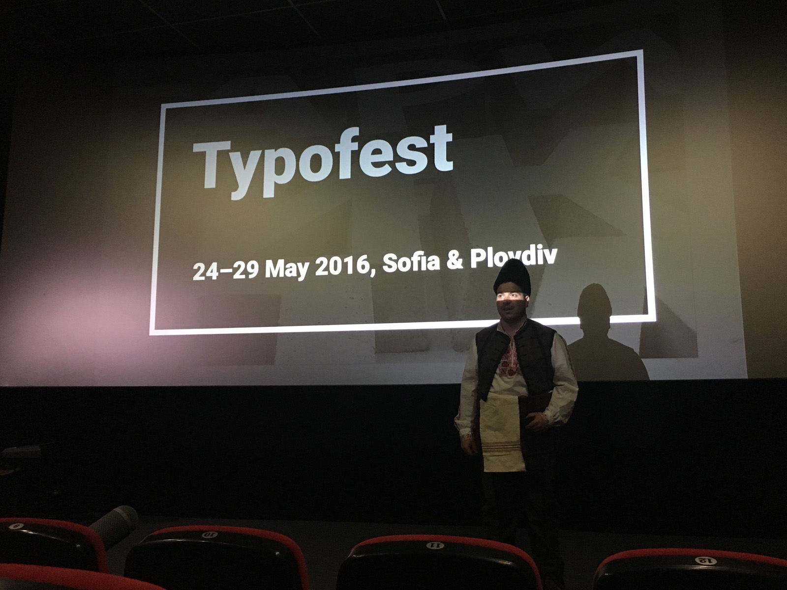
With great personal effort and enthusiasm, Typofest conference took place in Sofia and Plovdiv, Bulgaria, from May 24 to 29, 2016. Boril Karaivanov is the mastermind behind Typofest. He seems to be the initiator of a new self-esteem in Bulgarian type and graphic design, expanding into a fruitful international exchange.
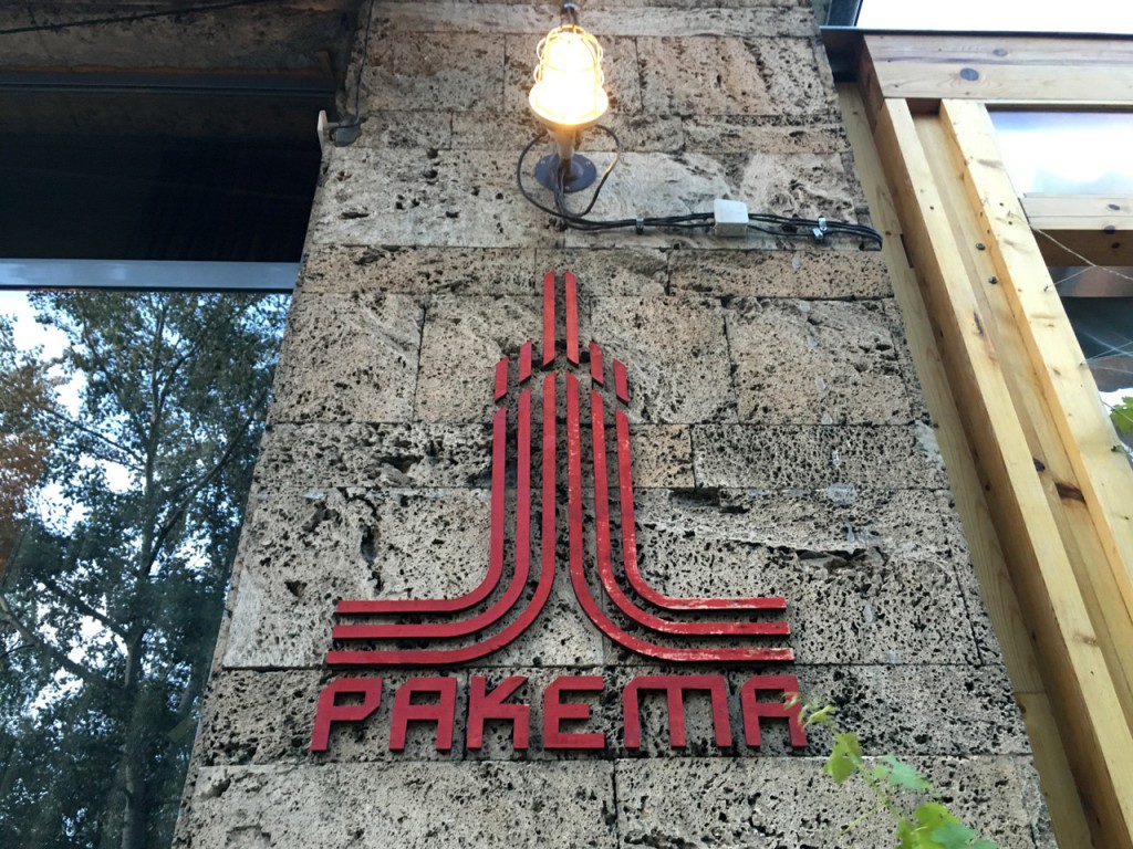
Raketa Restaurant in Sofia, Bulgaria (© Sonja Knecht)
Boril picked us up from the airport, after we had just discovered an article about typography and the Typofest conference written by him in the in-flight magazine. First impressions after landing: wonderful sunny weather, a great landscape with chains of mountains surrounding us, and a host displaying endless calm while taking organisational phone calls one after the other. He seems to take care of every guest personally. My husband, Lucas de Groot (TheSans, Calibri, etc.), was invited to give a three-day workshop and a lecture, so I was lucky to travel with him and co-enjoy.
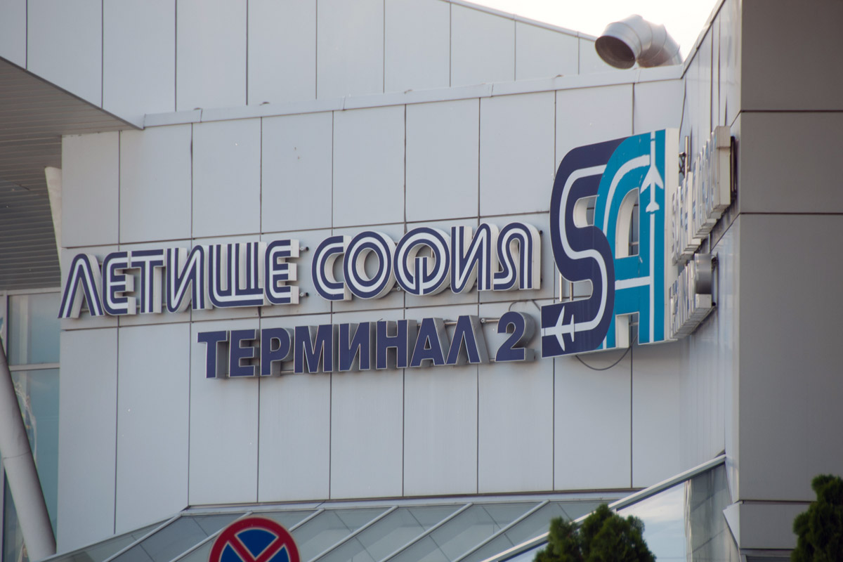
Airport signage (© Lucas de Groot)
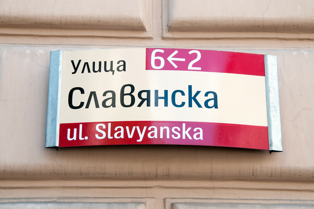
Street sign in Sofia (© Lucas de Groot)
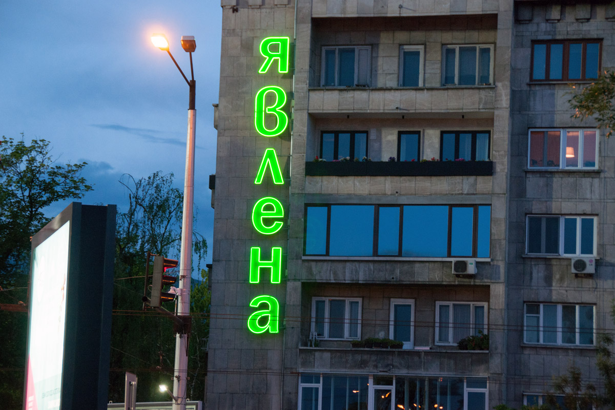
Real estate agency name “Yavlena” in Sofia (© Lucas de Groot)
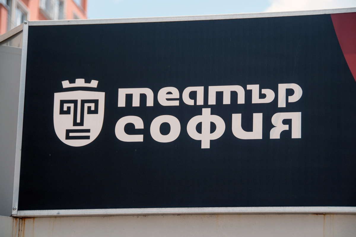
Theatre Sofia (© Lucas de Groot)
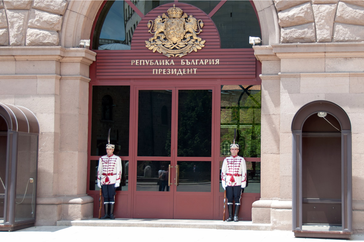
Guards at the presidental palace in Sofia (© Lucas de Groot)
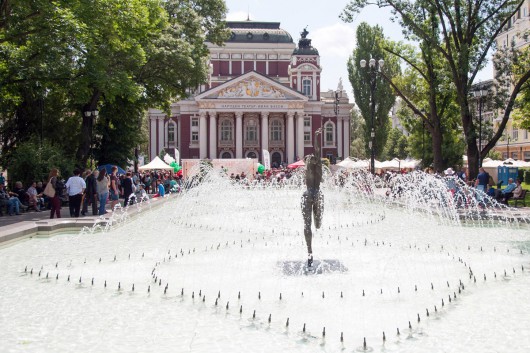
Theatre building in the centre of Sofia (© Lucas de Groot)
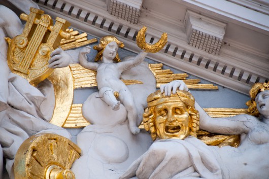
Zooming in: a golden willy under the theatre’s roof
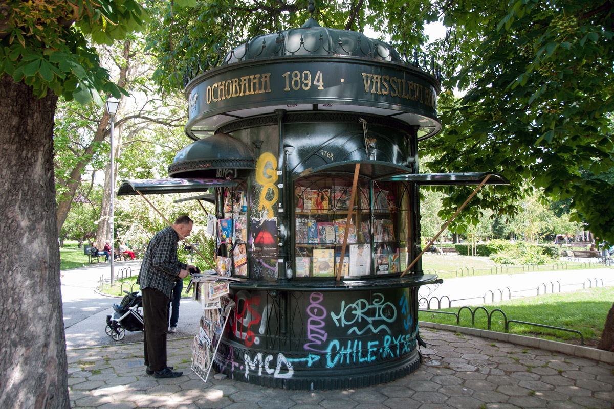
Kiosk in Sofia (© Lucas de Groot)
The Day of the Alphabet
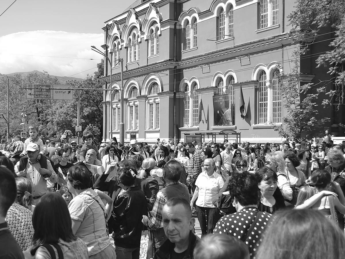
Boril brought us to the centre of Sofia and informed us about the course of events. On the next day, May 24, we would experience the Day of the Alphabet, a Bulgarian national celebration and public holiday. This is also the day of school graduation festivities – so basically everyone is on the streets: hordes of dressed-up students, proud parents and family, guards of honour, priests and even the president giving a public speech.
In Bulgaria people really care about Schrift.
We joined a big gathering in front of the university, next to the huge statue of Cyril and Methodius, the originators of the Cyrillic script. Television and press people everywhere, choirs singing, fanfares playing, ourselves in the midst of it all and full of admiration. They really care about Schrift here. We were given a Bulgarian magazine with typography as the lead story, full of contemporary Bulgarian type design, featuring type designers we would get to know in the days to follow.
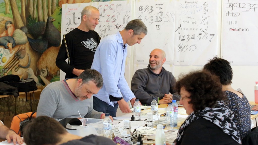
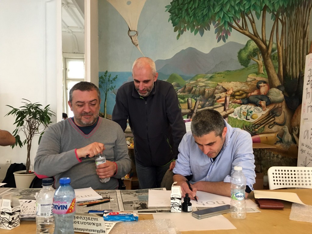
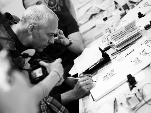
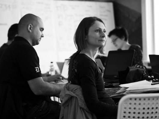
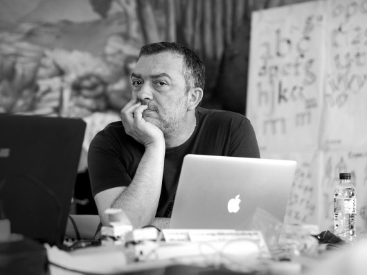
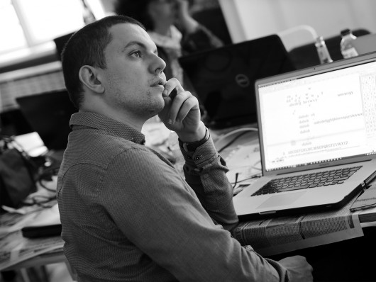
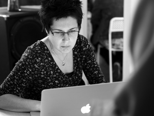
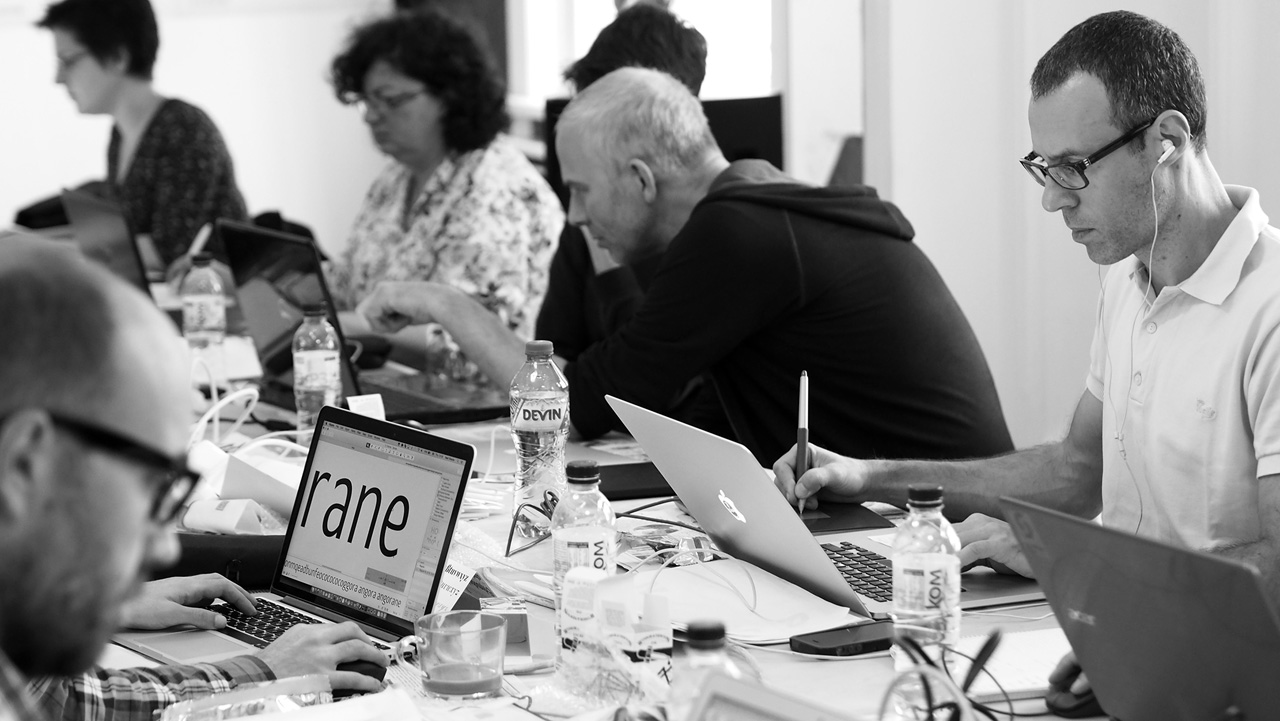
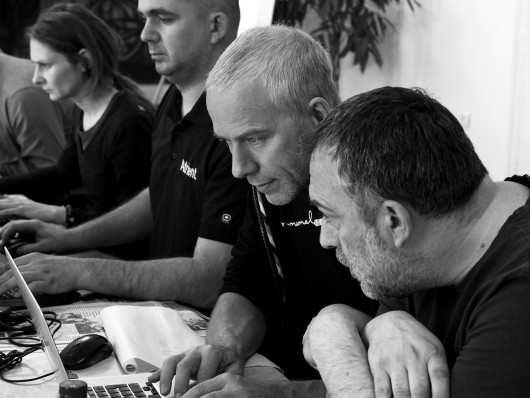
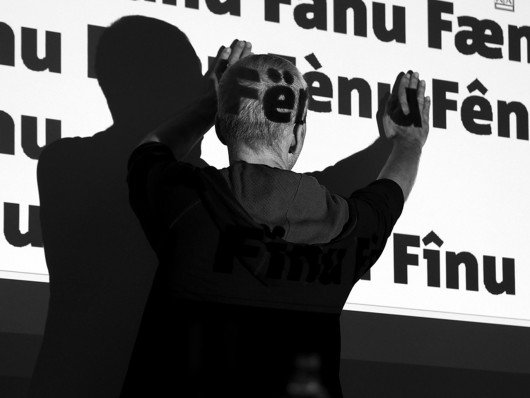
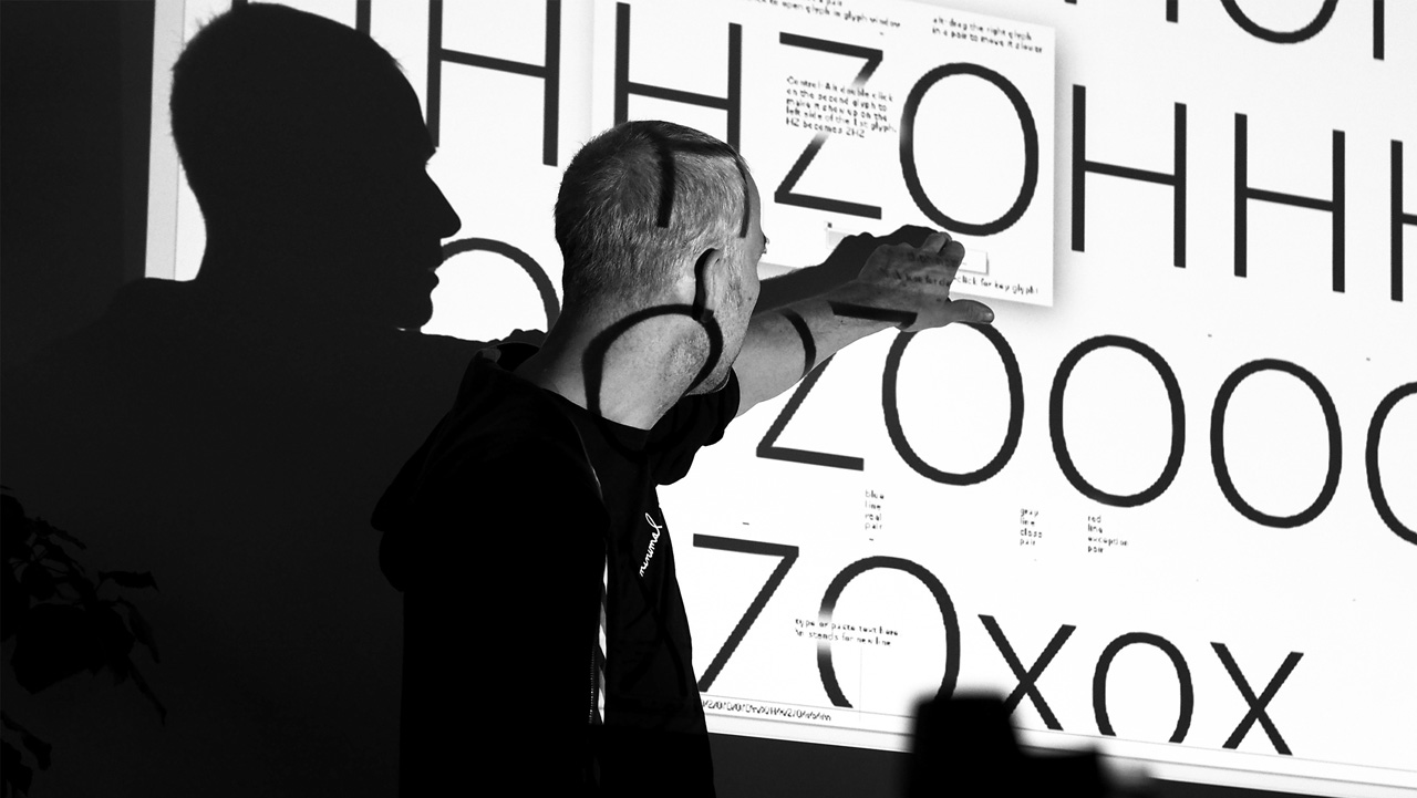
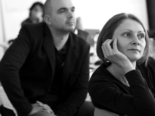
Subsequently the workshops started. Maria Doreuli from Moscow and Krista Radoeva from Bulgaria gave an intense three-day workshop, “Better Lettering”. Lucas gave his “Eye Opener Type Design Workshop”, conveying the intricacies of Latin type design by a mixture of lectures and a lot of practical work, from writing tools to digitisation.
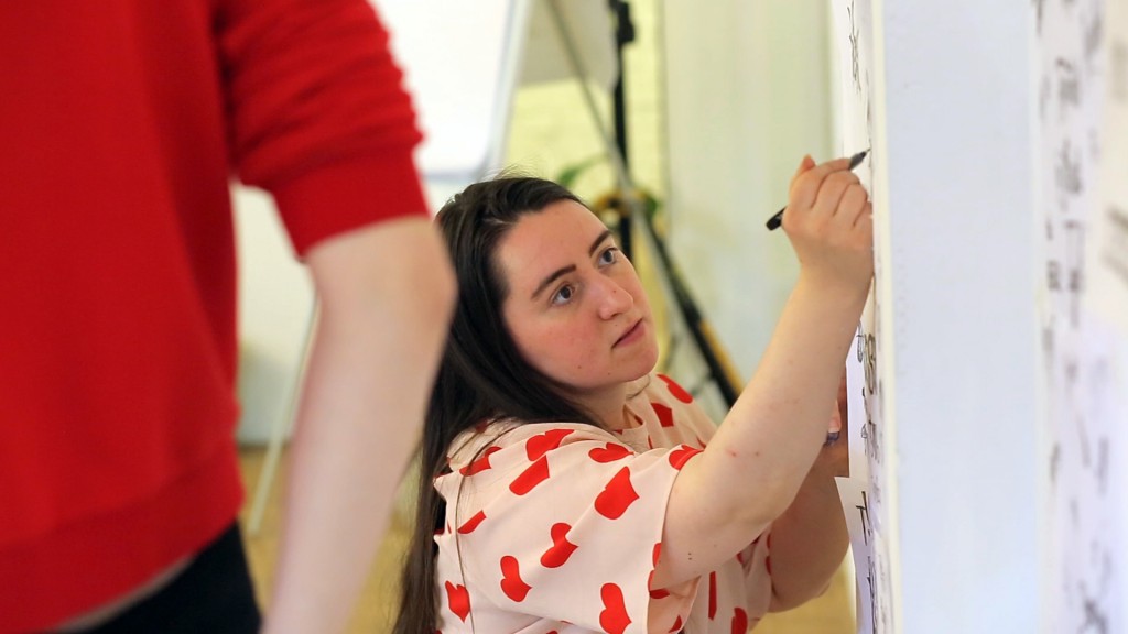
Krista Radoeva from Sofia (now in London and Reading) helped organise the conference; she gave the “Better Lettering” workshop together with Maria Doreuli from Moscow (© Boryana Pandova)
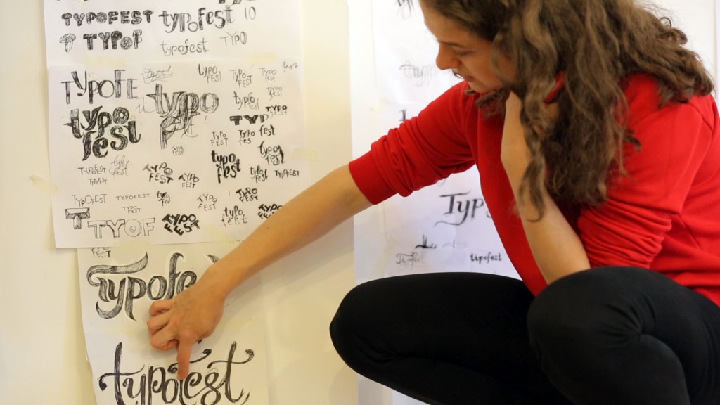
Maria Doreuli in their “Better Lettering” workshop (© Boryana Pandova, with kind permission)
The day after the workshops more conference speakers arrived and we were given a professional city tour. We got to know historic and architectural highlights (and there are many), we visited the St. St. Cyril and Methodius National Library, indulging in old books and manuscripts – and, we had great food. I mean, really great food. Also, the costs of living and accommodation in Bulgaria are very affordable to us foreign visitors.
In the afternoon, Lucas gave a live interview on Bulgarian TV. Taking the chance to speak in front of the camera, he aimed to raise the awareness for the beautiful Cyrillic letter shapes in Bulgaria, and he sneaked in a call for action to jointly persuade Microsoft to officially adapt Bulgarian glyph variants.
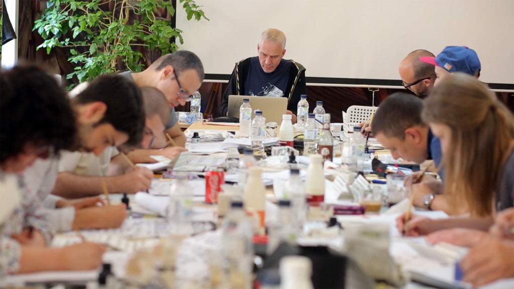
Lucas de Groot’s “Eye opener type design” workshop (© Boryana Pandova)
“We need to raise awareness.”
For Calibri he had already designed and provided them in 2003, but the Russian advisor named it “local fashion” and vetoed their implementation. Please see the full-length TV interview with Lucas de Groot about Bulgarian Cyrillic (18 minutes). (Maybe you like to do so after reading this article; you will find this and other relevant links at the end of the text.)
Boril Karaivanov enjoying a visit to Lucas’ workshop (© Boryana Pandova)
The Bulgarian musketeers
What is the issue with Schrift in Bulgaria? The country’s type heritage is present in people’s minds, being the cradle of the Cyrillic script in the ninth century – currently in use by more than 90 languages. Graphic design has always played an important role in Bulgaria, and using printed letterforms close to handwriting construction has always been natural in Bulgaria; however, in a period when the people had other things on their minds, and Cyrillic typefaces were mostly made abroad, there was a shortage of fonts with Bulgarian letter shapes, and there was a lack of type-conscious graphic designers making such fonts. After all, Bulgarians can read their language in “Soviet-style fonts” without problems.
Kiril Zlatkov, Boril Karaivanov, Prof. Dr. Iliya Gruev (© Sonja Knecht)
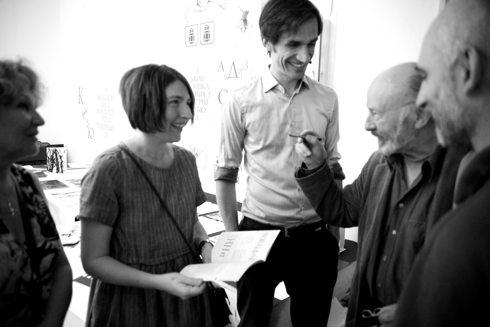
But things have changed: today there is a vivid type community emerging in Sofia. Together with Boril Karaivanov, Kiril Zlatkov, Iliya (or Ilia) Gruev and Velina Mavrodinova – nicknamed the four type musketeers – have set up a manifesto about Bulgarian Cyrillic, and organised the first Typofest conference in 2014, gathering Bulgarian type/graphic designers and teachers to focus on Bulgarian typography. Typofest 2014 might be considered as the founding event of the Bulgarian type design community today, the first after Bulgaria joined the European Union in 2007.
This was when they missed their chance to get Bulgarian Cyrillic officially recognised. But now things are on their way. Since 2013 we have a beautiful new 5-euro note which carries “Euro” written in Cyrillic letters (in addition to Latin an Greek) – due to Bulgarian efforts. Bulgaria, the only EU country using Cyrillic, is not yet a member of the eurozone; but maybe this is already a political signal of the ECB’s trust in the future enlargement of the European single currency area. Two candidate countries, Macedonia and Serbia, also use the Cyrillic alphabet …
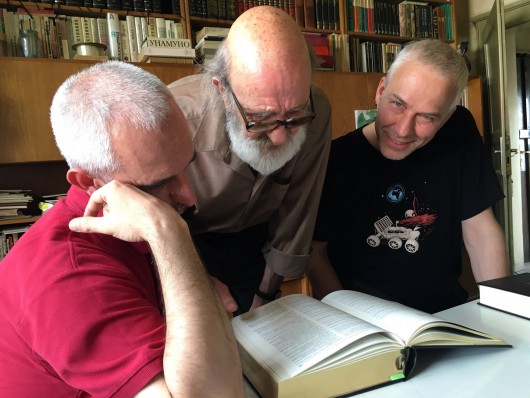
Boril Kariavanov and Lucas de Groot visiting book and type designer Kancho Kanev (“Uncle Kancho”) in his studio in Sofia (© Sonja Knecht)
Kancho Kanev (right) is one of most important figures in establishing the Bulgarian form of Cyrillic letters (together with Prof. Vasil Yonchev, who will follow depicted below)
From Sofia to Plovdiv
With a busload of friends and colleagues we were brought from Sofia to Plovdiv, again being taken care of in an extremely nice and relaxed way. After a three hours ride we reached Пловдив, hometown of Typofest founder Boril Karaivanov.
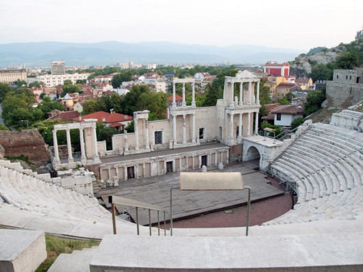
View from the Plovdiv hills to the ancient city centre (© Lucas de Groot)
Lucas de Groot and Thomas Milo, preparing their talks for the conference (© Sonja Knecht)
Plovdiv, this fascinating small historic city, has been inhabited at least since the 7th millennium BC! No wonder Plovdiv will be the European Capital of Culture in 2019. The ancient city centre is romantically embedded in seven hills, and when people dig in their gardens they might strike an ancient temple, aqueduct or amphitheatre, as we saw. Both Sofia and Plovdiv left great impressions on us. Spending time there with our colleagues provided a deep feeling of friendliness, collegiality, and internationality.
Conference in a Kino
The word for cinema or movie theatre in Bulgarian and Russian is the same as in German: Kino. But, note, Bulgarian and Russian are different languages, both written with a slightly different subset of Cyrillic letter shapes. Bulgarians and Russians cannot understand each other in their mother tongues (similar to Spanish and Portuguese, or German and Dutch). But we all know what a Kino is by now, and the Typofest conference took place in a Kino in Plovdiv.
Boril Karaivanov and Sonja Knecht (© Lucas de Groot)
Despite gaps of language and distance, there has been a lively exchange between Boril with Typofest and Gayaneh Bagdasaryan – initiator of the Serebro Nabora conference in Moscow – since Boril visited Moscow in 2013 at the second Serebro Nabora.
Russian speakers Danila and Gayaneh, leisure style (© Sonja Knecht)
Gayaneh Bagdasaryan was a speaker at TYPO Berlin in 2015 and at this year’s Typofest. We met both her and Boril first in 2014 in Moscow (please find my Serebro Nabora conference report here).
Boril Karaivanov: “It is a process.” And it works.
Boril speaks Russian, so he can easily exchange views with the Russian colleagues. “Talking with Gayaneh, Danila (Danila Vorobiev) and others helped me a lot to understand the attitude of the Russian type designers to the Bulgarian form of Cyrillic”, he says. “That naturally boosts the cooperation with Paratype for the project to add Bulgarian forms to PT Sans.” Here we are at the core of the topic: Bulgarian forms being included in Cyrillic font families. It goes slowly, step by step, and not everyone is convinced yet. “It’s a process”, as Boril puts it, with a smile.
Typofest speaker Danila Verobiev, who is a type teacher at Synergy University, at Tagir Safayev’s School of Type and Typography, and at the Institute of Business and Design in Moscow
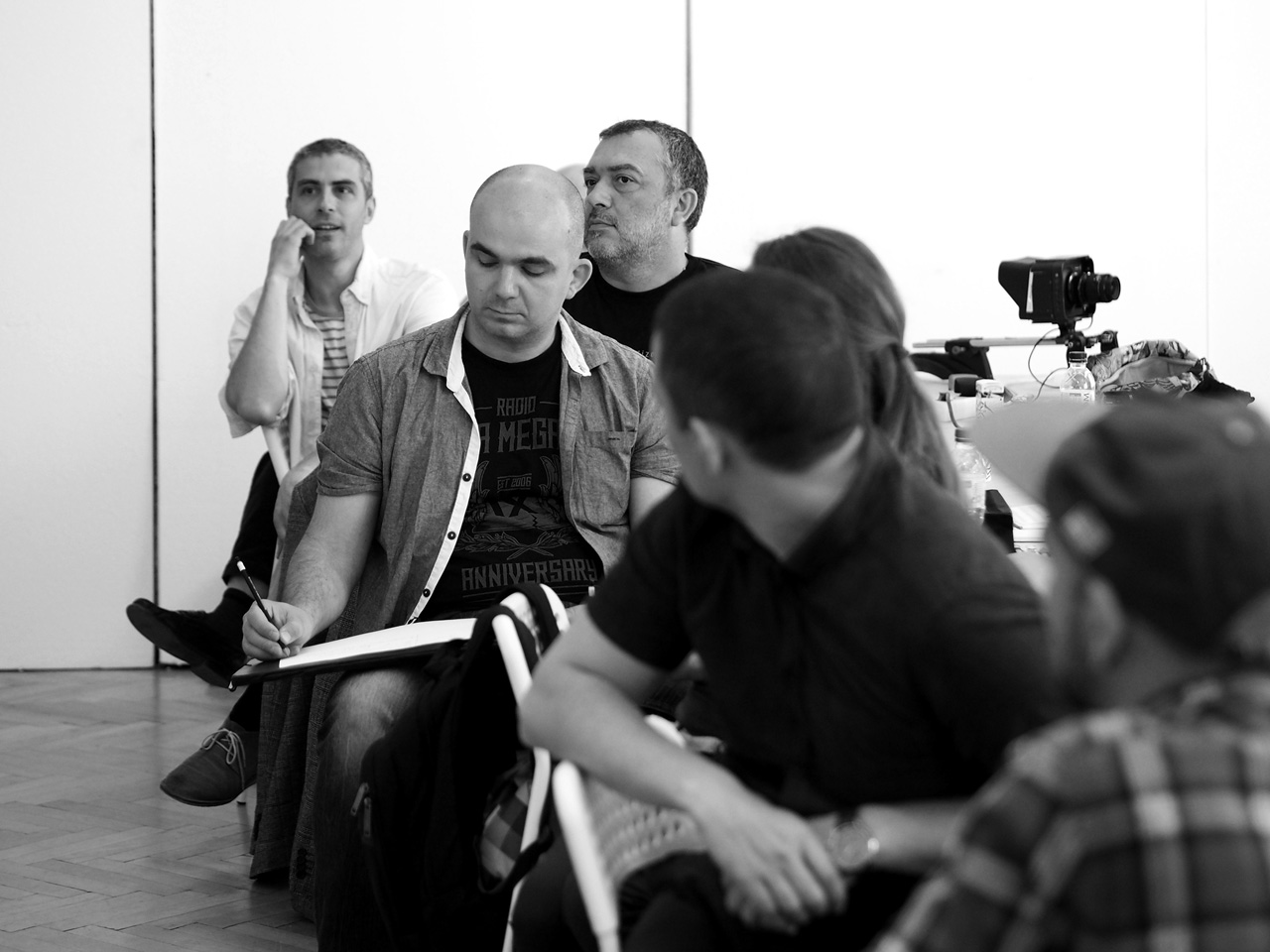
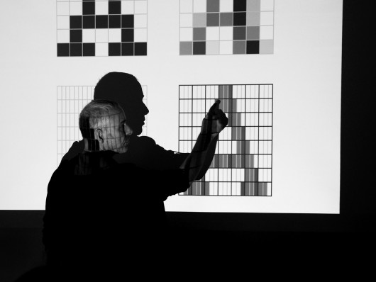
Yes it is a process and he already achieved a lot. About 300 guests attended the very well organised two days of presentations in the Plovdiv Kino: a very concentrated, respectful and mostly local audience absorbing state-of-the-art type design methods, attitudes and tools being displayed. International type design experts, engineers and software developers highlighted core topics of their respective fields.
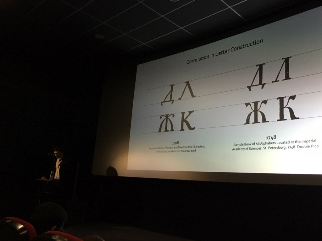
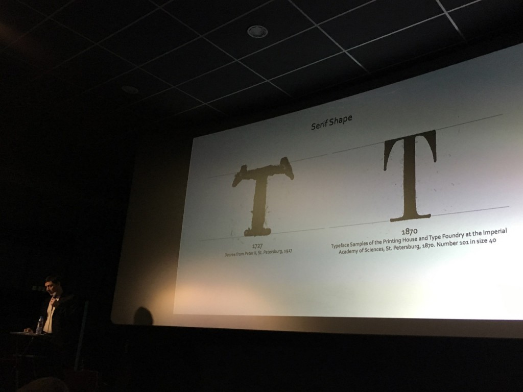
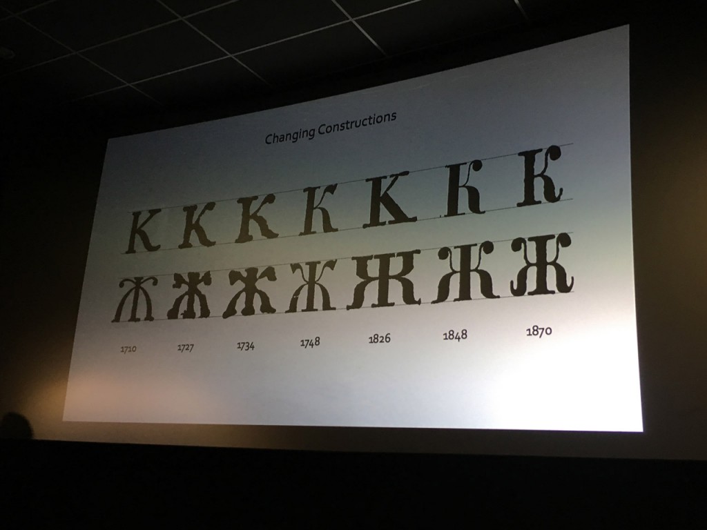
Danila’s topic: “Evolution of the construction of letterforms in Russian typefaces from the XVIII–XIX centuries” (© Sonja Knecht)
I personally liked those talks best which have direct cultural implications, like Nikola Djurek sharing his experiences with imposed Cyrillic on the Balkans (I wrote extensively about it in my article about ATypI Barcelona 2014).
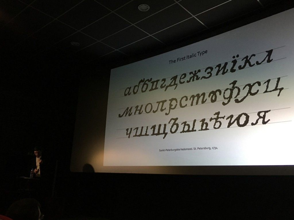
In his very well structured talk Danila focused on key moments in the development of Russian typefaces; fortunately he did this in English (lucky us)! (© Sonja Knecht)
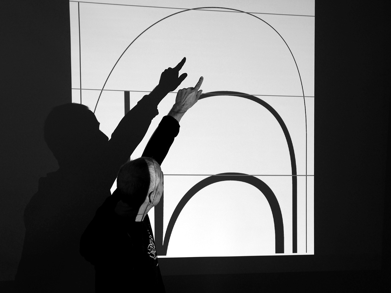
In his talk at Typofest, Nikola referred directly to questions of identity with his Identitet type system, harmonising six different writing scripts (Angular Glagolitic, Round Glagolitic, Croatian Cyrillic = Bosančica, Cyrillic, Arebica and Latin) in their visual parameters to work together.
Looks like yes, we can rely on historical continuity: Danila Vorobiev at Typofest
Henning Krause of Monotype explained their approach to whether and how to localise fonts to regional language systems and markets – Monotype sets up new internal standards in doing so. Good to see that the biggest player in the industry finally takes localisation seriously … Sad to see though that they did not chose to be sponsors of this great, boundary expanding conference.
Bulgarian Cyrillic
Lucas the Groot was the last and definitely the keynote, or rather, the “core note” speaker at Typofest. For 20 years already Lucas has been designing and promoting Bulgarian Cyrillic. In his lecture, he showed that these letter shapes are also used in other countries. Back in the 1990s he found them in Moscow and in St. Petersburg, in the Ukraine and in lettering from Kazakhstan.
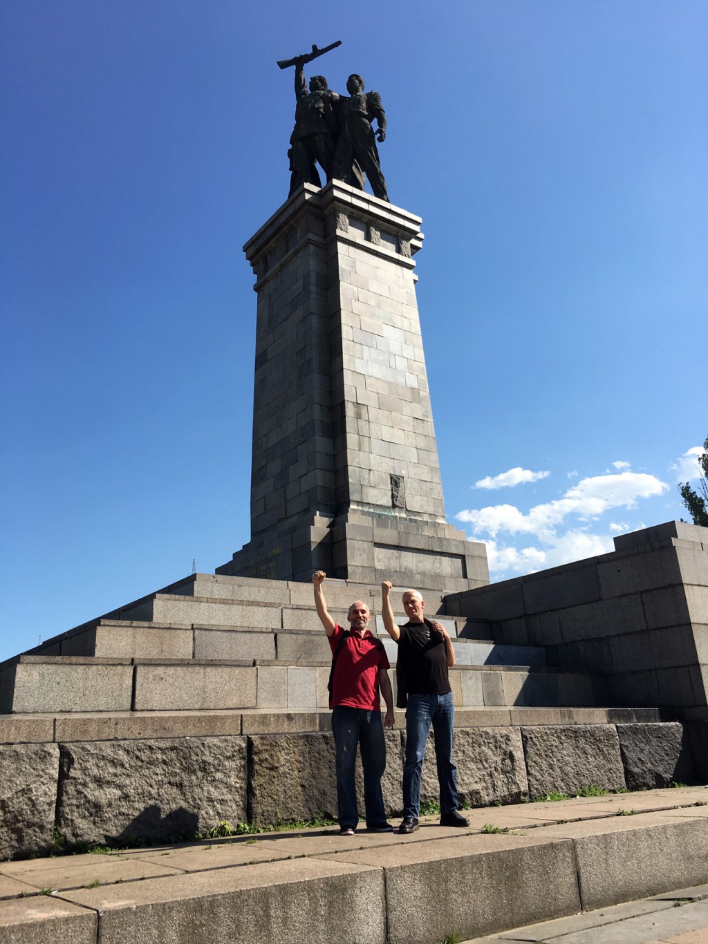
Two monuments: Boril Karaivanov and Lucas de Groot (© Sonja Knecht)
Lucas gave an overview about his research, travelling to “Cyrillic countries” with humorous and provocative interpretations of type history, and how he learned to design Cyrillic and Bulgarian versions of his font families – plus he put a clear statement out to the world about the beauty and practicability of Bulgarian glyphs.
Lucas (and many others) wish that the Bulgarian glyph variants will become default in Cyrillic one day. At Typofest, Lucas caused a big laughter in the audience when he suggested “Bulgarian Cyrillic” should be simply called Cyrillic from now on, and the other style “Historic Cyrillic”. Worth thinking, it seems.
“The difference is clearly to be seen, even if you are not a Russian or Bulgarian native and even if you don’t know Cyrillic letters.” – Lucas de Groot
Very seriously Lucas informed us of the fact that Bulgaria is the main breeding ground of more humanistic constructions of Cyrillic letterforms.
So, what about them? How to describe the look and feel, the reading experience with Bulgarian letterforms? They are not unfamiliar to Russian readers. All people who have grown up with Cyrillic alphabets can read Bulgarian letterforms easily, because they come from the handwriting children learn in school – but they might convey a different feeling. To most people they just seem friendlier. Traditional Russian typographers might call them childlike or naïve, but many young Russian designers love them.
A gift to Lucas: Bulgarian letterforms in an old children’s book (© Lucas de Groot)
New awareness, new contacts, new chances arising
There is a renewed awareness to be noticed for Bulgarian Cyrillic, not only among Bulgarians, but in the minds of international type designers and foundries as well. The beauty of those 16 or 17 specific Bulgarian glyphs appeals to many designers.
Lucas de Groot designed the Bulgarian Cyrillic version of TheSerif for the Bulgarian newspaper Dnevnik in 2008 (© Lucas de Groot)
Lucas explains: “The difference is clearly to be seen, even if you are not a Russian or Bulgarian native and even if you don’t know Cyrillic letters: in contrast to the Russian style, most Bulgarian Cyrillic lowercase letter shapes are different from the capital shapes. Russian Cyrillic looks like small caps to us, Bulgarian looks more like lowercase.” Former TypeMedia student Krassen Krestev from Sofia spoke at TYPO Berlin 2015 about Bulgarian Cyrillic, its origins and “identity in progress”, and how the enhanced variety of shapes in Bulgarian lowercase is better for letter recognition.
Cyrillics with Bulgarian letterforms handwritten by Lucas
These aspects are not only noticeable for type specialists, they appeal to many readers and make sense for broad audiences. And this is why Lucas de Groot together with Boril Karavanov, Krassen Krestev and others are engaging so intensely in getting Bulgarian Cyrillic – or might it work to call it Humanistic Cyrillic? – to the foreground in international (type) design.
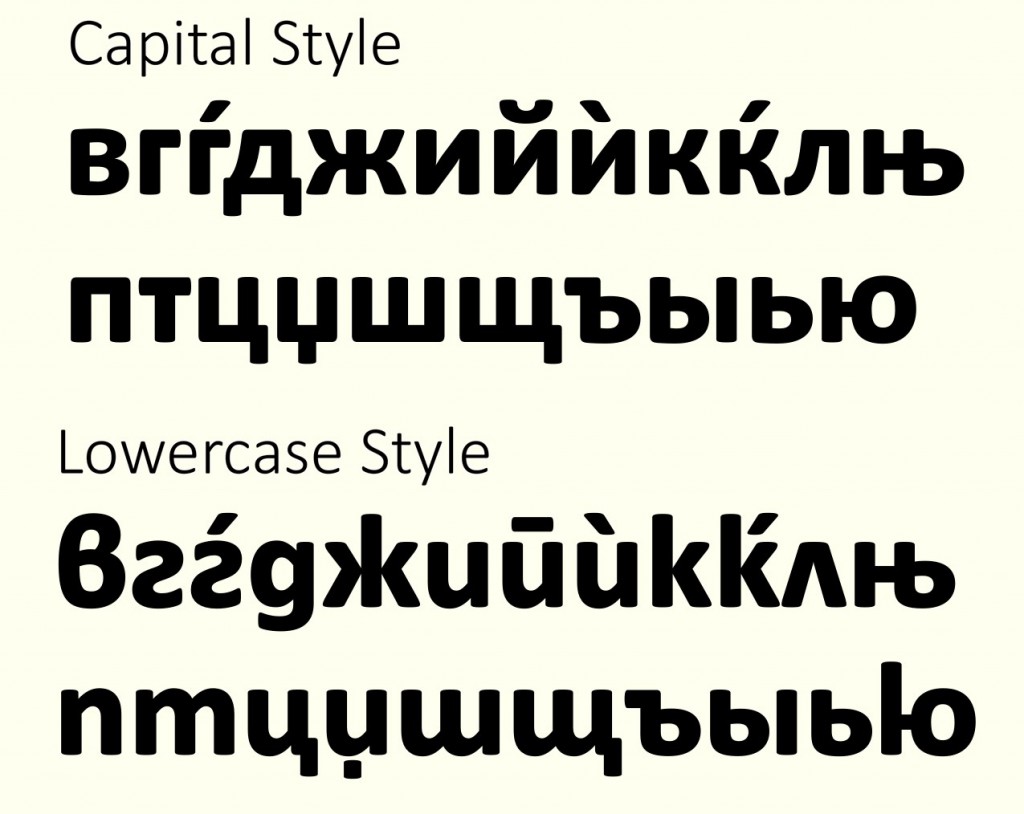
Capital and lower case Cyrillic style letterforms, or Russian (“Soviet-style”) and Bulgarian Cyrillic, as designed for Microsoft’s typeface Calibri by Lucas de Groot
Type is culture is politics is beauty
At Typofest Bulgaria it is to be seen once more: people involved in type are cultural ambassadors. People who deal with Schrift provide the grounds for written communication, for journalism, for the expression of opinions. This is why it is so crucial that we bring all things type further. We need to exchange, and we have to encourage each other at times. Here in Berlin we are happy to have abundant collegial exchange, as elsewhere in “the West”, in Europe, the US. But, as some of our readers might remember: TYPO Berlin also started off as a very small initiative of a bunch of people – and look how far we have come today, how we have grown.
It is beautiful to see this happen in Eastern countries now. What was once behind the Iron Curtain is now really close. From Berlin to Sofia is just two hours by plane, no visa needed. Getting to know each other across borders is beautiful in itself, and in the realm of type, it is a necessity. It means taking part in every nation’s cultural developments. This is Europe, friends.
For further information:
Please find all speakers and programme on the Typofest website and do not miss the next conference and workshops taking place in Sofia and (hopefully) Plovdiv, planned for 2018. You also find photo impressions of Typofest on Flickr.
A traditional Bulgarian singer sings to our honour at the finale of Typofest 2016
Contact people in Sofia:
Find Boril Karaivanov on Facebook and in his studio Redesign; find Kiril Zlatkov on Facebook and on Behance; find Prof. Dr. Iliya Gruev, or Ilia Gruev (Илия = Iliya, but often Ilia), who works at the National Academy of Art Sofia, on Facebook and in his studio Moire in Sofia; find Velina Mavrodinova on Facebook and in her studio Enthusiasm in Sofia. The four of them worked out a manifesto about Bulgarian type that will be available in English at some point soon. Please find Prof. Todor Vardjiev on Facebook and his biography here.
This article was written by Sonja Knecht and Lucas de Groot. Our title picture shows the finale of Typofest conference 2016: a classical singer presenting traditional Bulgarian chants to us, which was overwhelmingly beautiful, and followed by a big philharmonic choir live on stage in the “Lucky Cinema” in The Home of Science and Technics, Plovdiv.
Please see the TV interview with Lucas de Groot about Bulgarian Cyrillic (18 min).
Further readings:
On the technical background: Which characters do you have to consider if you want to equip your font with Bulgarian and Russian Cyrillic? Learn how to deal technically with the characters ѓ ќ ґ ғ җ ҙ қ ҝ ҡ – as described in this article by Botio Nikoltchev on How to make an entire Cyrillic Extended.
A series of columns on letters from the Cyrillic alphabet: What happens when we compare a letter with similar characters in a type system? The letterform begins to make sense. Type designer Gayaneh Bagdasaryan shares her opinion on shaping one of the trickiest letters in our alphabet: A Look at the Letter б.
(Thank you very much Frank Aadebiaye for providing us with these links and the one with the Cyrillic “Euro” on our bank notes.)
Typofest visitors visiting the National Academy of Art Sofia: Irina Petrova, managing director of Paratype; Alexandra Korolkova, art director at Paratype and speaker at Typofest 2016; Georg Seifert, type designer and creator of Glyphs font editor); Prof. Todor Vardjiev, type designer and teacher at the National Academy of Art in Sofia; Boril Karaivanov, graphic designer and Typofest mover – one of many summits in themselves at Typofest this year (photo © Laurence Penney, speaker at the conference)
A big thank you to Boril Karaivanov for making all this possible.
A big thank you also for kindly providing us with a huge amount of wonderful pictures! Thanks to the passionate local photographers! Please find photographer Boryana Pandova (Buria Pandova) on Facebook and on Behance, please find visual artist Svoboda Tzekova on Facebook, and take a look at the illustrations on her website. – Please enjoy some more impressions of the Day of the Alphabet festivities and of Lucas de Groot’s “Eye opener type design“ workshop:
Everybody out in the streets: the Day of the Alphabet in Sofia, Bulgaria, June 24 2016 (© Svoboda Tzekova)
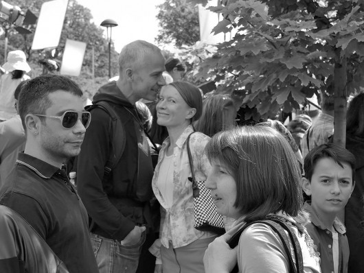
With sunglasses: Bulgarian Berliner Botio Nikoltchev, Lettersoup, guarding us super nicely in his hometown Sofia; together with (right in front) Pepa Karaivanova, graphic designer, wife and partner of Boril in their studio Redesign (© Svoboda Tzekova)
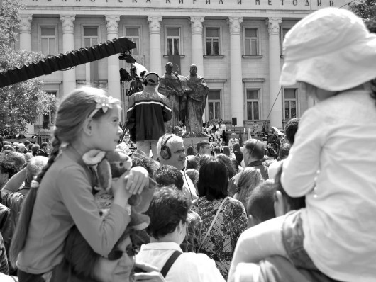
In front of the National Library in Sofia, where the main celebrations and speeches for the Day of the Alphabet took place (© Svoboda Tzekova)
Good mood: Prof. Todor Vardjiev of the National Academy of Art (right) enjoying a visit to Lucas de Groot’s workshop (© Svoboda Tzekova)
Krassen Krestev, Nikolay Tenev (© Svoboda Tzekova)
Plamen Motev (Phenomena font, with Radomir Tinkov)
Lucas de Groot (© Svoboda Tzekova)
Radomir Tinkov (Qanelas, Maja Script, and more)
Ilia Gruev, Vladimir Stoyanov, and Kiril Zlatkov in Lucas de Groot’s workshop at Typofest (© Svoboda Tzekova)
Lora Milcheva (© Svoboda Tzekova)
Kiril Zlatkov (© Svoboda Tzekova)
Svetoslav Simov (© Svoboda Tzekova)
Maya Trifonova (© Svoboda Tzekova)
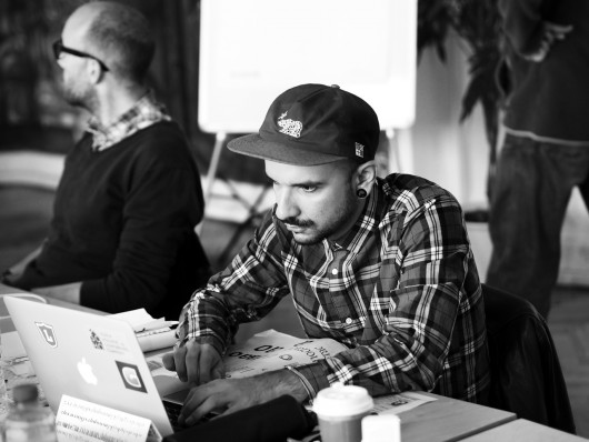
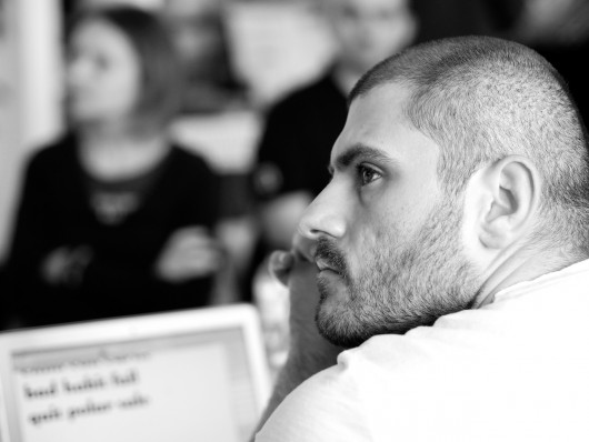
Right: a highly concentrated Krassen Krestev, who spoke about Bulgarian Cyrillic at TYPO Berlin 2015, in the workshop (© Svoboda Tzekova)
Lucas de Groot, Kiril Zlatkov (© Svoboda Tzekova)
Lucas de Groot (© Svoboda Tzekova)
Lucas de Groot, “Eye opener type design” workshop (© Svoboda Tzekova)
Lora Milcheva (© Svoboda Tzekova)
Lucas de Groot (© Svoboda Tzekova)
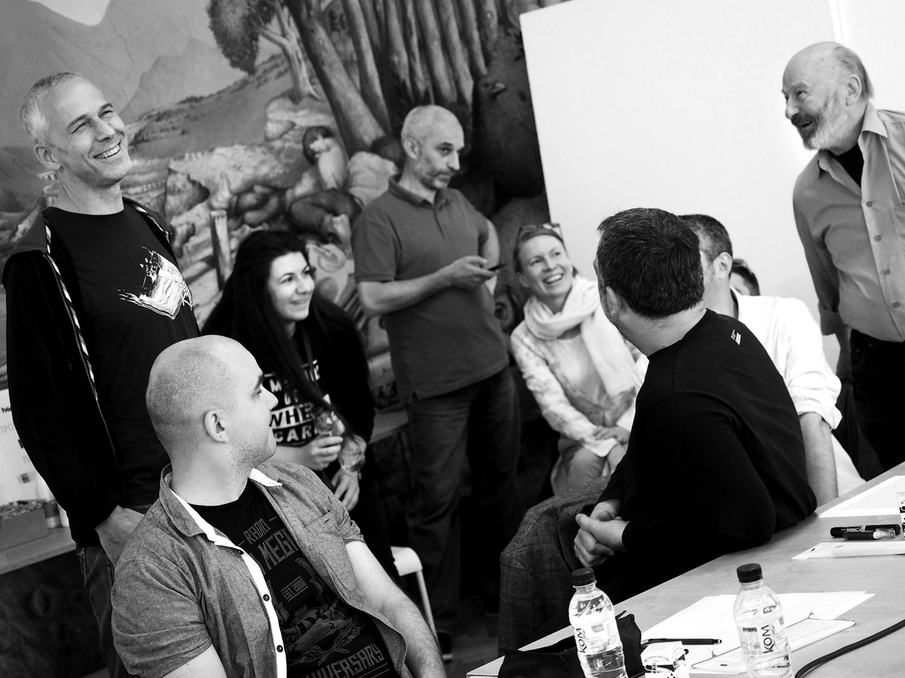
All participants of the workshop “Eye Opener type design” with Lucas de Groot; standing from left to right: Boril Karaivanov, Bruno Sáez López, Svetoslav Simov of FontFabric (with a “c”), Krassen Krastev, Nikolay Tenev, Plamen Motev, Vladimir Stoyanov, Prof. Dr. Iliya Gruev (or Ilia Gruev), Kiril Zlatkov and Nikolay Petrusenko; sitting from left to right: Radomir Tinkov, Maya Trifonova, Sonja, Lucas, Boryana Krasteva and Lora Milcheva. (© photographer Boryana Pandova aka Buria Pandova)
Lucas de Groot, Bulgaria 2016 (© Svoboda Tzekova)
This article was published first on 9 August 2016 on TYPO News, the blog of TYPO International Design Talks. Written together with Luc(as) de Groot, and approved by him (for all content including related to his workshop, participants etc.). Photo credits see above.