Some characters call for more attention than others – they come as troublemakers, causing heated disputes. Get to know the outsider among our punctuation marks.
With their work and way of looking at the world, type designers tend to touch all kinds of cultural and, of course, intercultural topics. Maybe that is because they consider tiny little details, at the same time paying attention to the big picture? Most type conferences get political and/or philosophical at some point.
In Moscow at the Serebro Nabora conference, among a lot of profound and highly interesting lectures, I was happy to encounter someone who in his talk examined one single glyph, and not even a letter, but a punctuation mark: to unfold all sorts of fascinating implications.

Early arrivals in the frosty night before the conference: David Jonathan Ross with his wife Emily, Daria Petrova, Olka Pankova, then (hidden beneath her yellow cap) Frederik’s wife Elisabeth, next to Maria Doreuli, Gayaneh Bagdasaryan, Frederik Berlaen, Luc(as) de Groot and Aleksandra Samulenkova.


Serebro Nabora conference venue: House of Architects, Moscow
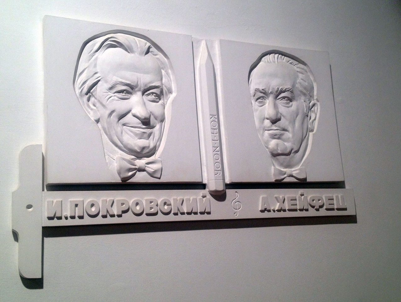
Like an anthropologist
Eugeny Grigoriev is a book designer from Saint Petersburg. He condensed his findings about The Dash. Rules and Aesthetics to an inspiring lecture, summarising the astonishing history of the dash – or rather, a history of several dashes.
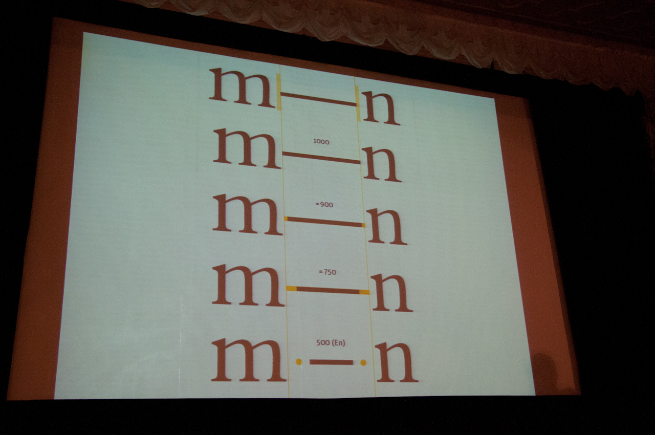
Em- or en-dash? With spaces or without?
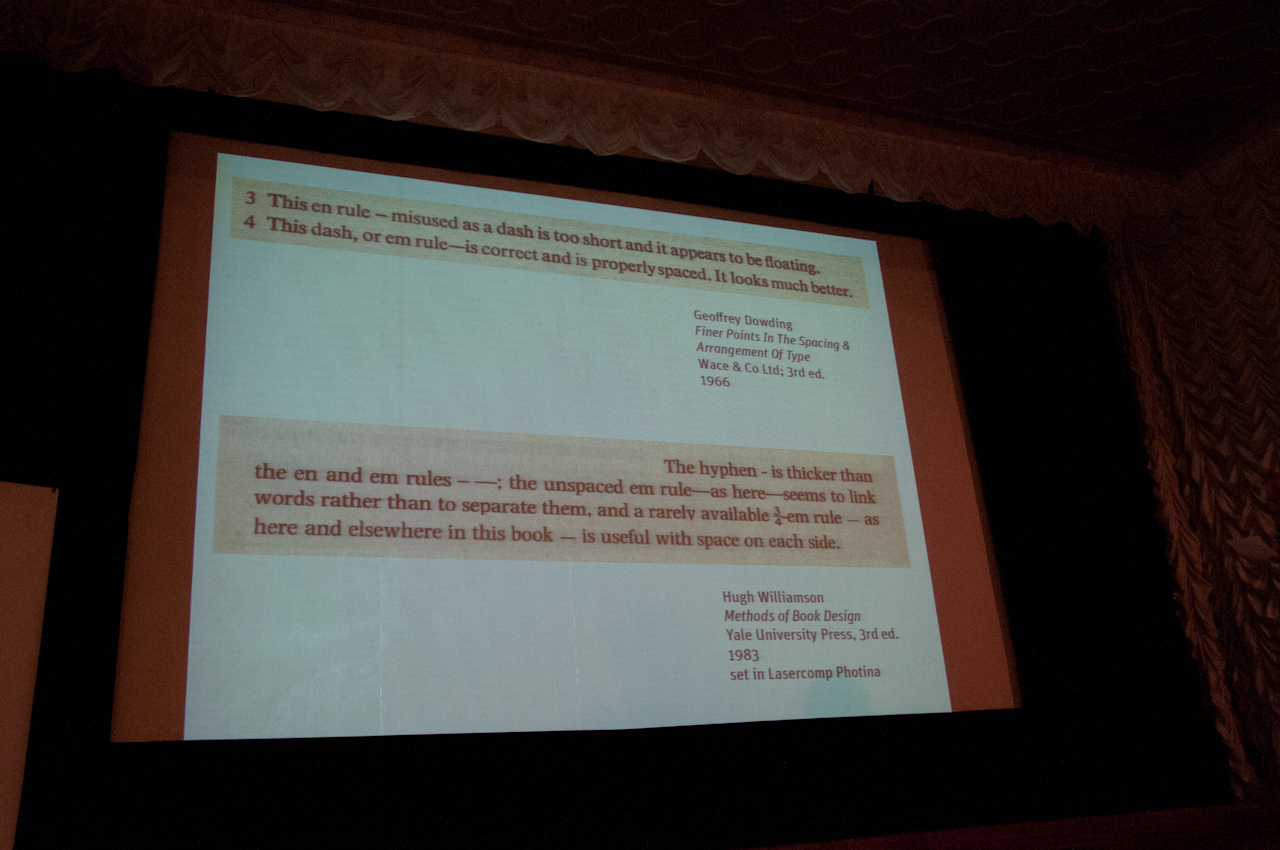
No other punctuation mark seems to have caused such heated disputes as the dash did.
Is it em- or en-dash? Sidebearings or not? With spaces around it, or without? The setting rules, affected by traditions and technologies, have been changed in various typographic cultures. The typographic standards have not survived. But not because nobody would care: throughout decades, no other punctuation mark seems to have caused such heated disputes among type designers and typographers. Eugeny said he feels like an anthropologist with his topic – “and people also laugh about it”. Well, nobody in the audience did. Welcome home, Eugeny.
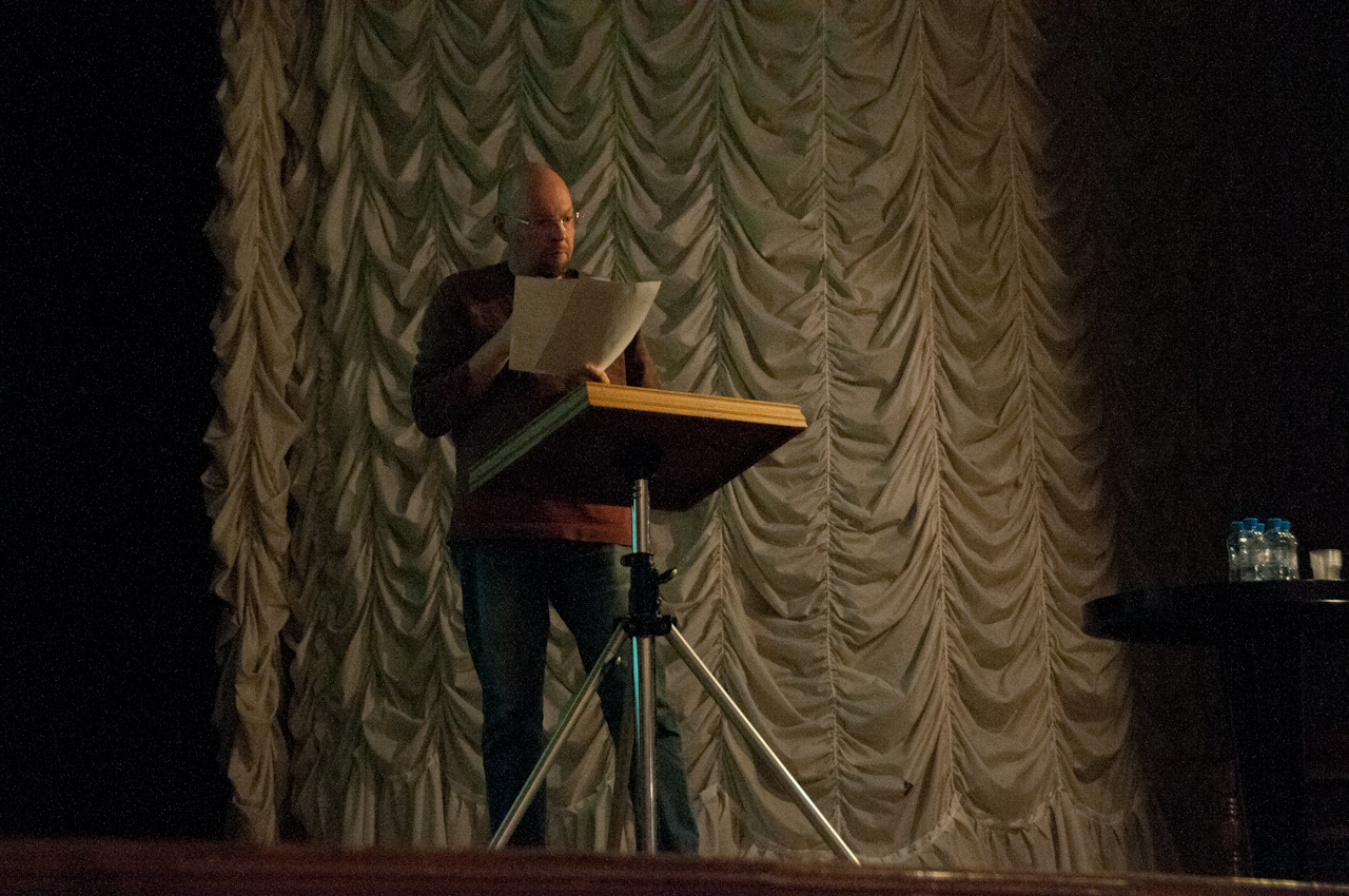
Eugeny Grigoriev, dash expert and book designer from Saint Petersburg.
The outsider among the punctuation marks
Eugeny-the-dash-expert gave us a survey: the dash is one of our youngest punctuation marks. It appears first in the 18th century. Thus, you can not find dashes in the bible. If the dash is at the place where it should be it has a certain meaning. The shape of the dash and its length can influence the reader’s perception. So far so good – so useful. But actually the dash came “as an unpleasant surprise” for typesetters and typographers. They had to struggle heavily with the new sign.
Why?
What is the problem with the dash?
It is horizontal.
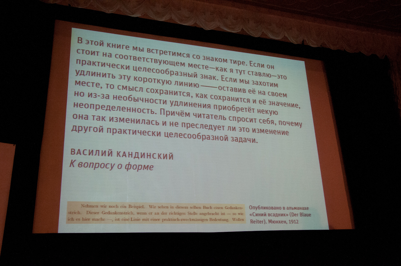
The biggest problem with the dash is simply that it is horizontal, thus always standing out from the rest of the text.
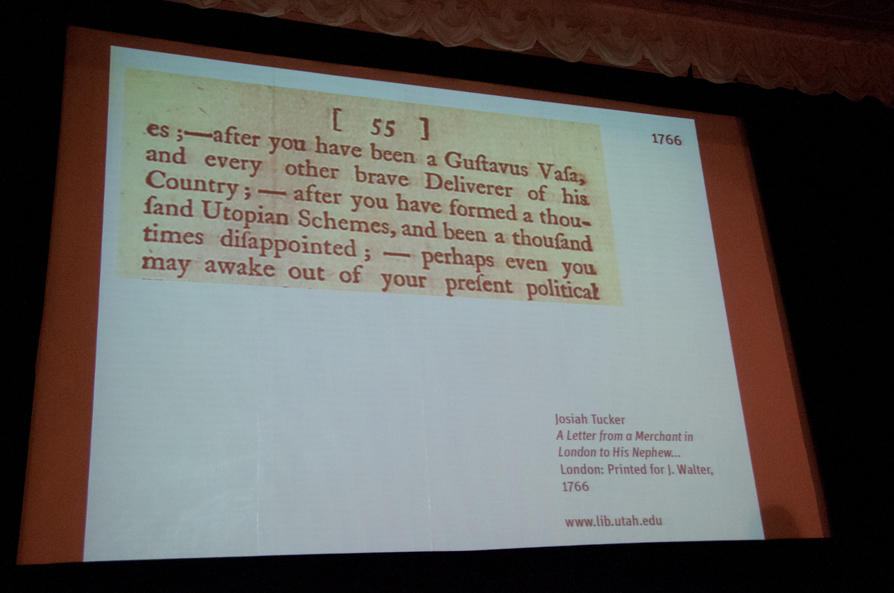
A thousand utopian schemes have been formed around the dash.
In the beginning, typesetters used unspaced dashes, which was strange because usually the hyphen is the one which unites whereas the task of the dash is to clearly separate. A dash with no spaces looks like it unites – quite a contradiction and wrong in the eyes of the reader. Here, optical aspects collide with function and meaning.
The Germans were the most unlucky
Eugeny Grigoriev displays dash traditions of several language systems:
- In France, spaces were used everywhere, not only before and after a dash.
- The Germans were the most unlucky typographers, because they have a lot of vertical letters. They started to use spaces with the dash, but with Fraktur it looked really strange.
- In Russia, they imitated everything from the German, even the composition. We see unspaced en-dashes and middle hyphens with spaces combined.
Note: A dash was not part of a typeset. It was more like an unwelcomed outsider that had to be integrated in one way or the other.
In the early 20th century, dramatic changes arose:
- Jan Tschichold came to England and said the em-dash was too long; and he found it strange that dashes were not casted for each size.
- “In Monotype fonts, en dashes are part of the normal complement. For Linotype, they can be specially ordered. A manufacturer of books who desires flawless typesetting may and must insist on en dashes”. Quote taken from Jan Tschichold’s essay “Dashes” in his book “The Form of the Book: Essays on the Morality of Good Design”, thankfully published in English in 1991: translator Hajo Hadeler, introduction by Robert Bringhurst. (The original German version – “Ausgewählte Aufsätze über Fragen der Gestalt des Buches und der Typographie” – was first published in 1975). Highly recommended!
- Oxford University Press decided to still use em-dashes, the rest of the editors gave it up. Here we can learn a lesson, says Eugeny, to him this is quite an interesting example. I guess we all get the side note…
To summarise these last bits and the ongoing confusion: dashes were obviously not designed and produced in a variety of sizes, widths or contrasts (so they would fit to each typeface in different grades). They seemed not to belong to the character set; and they were absolutely difficult to integrate. Like if they would baulk against being part of the typeset.
The different efforts produced some conflicts and discussions, like what Eugeny calls “elongated hyphen vs bastard dash”: the em-dash should never be a substitute for a hyphen. A hyphen is thicker than the em-dash and supposed to be uniting, not separating. There is the ¾-em rule, which according to Eugeny and his findings, seems to be quite useful. And there was also “Robert Bringhurst vs the Chicago Manual of Style”: an em-dash is more like an exclusion rather than a part of a normal type set, he said; it is much too long and dramatically long, he said. So in many cases, it was aesthetics vs semantic function.
Even with contemporary typefaces, fonts “offer surprises” as far as dashes are concerned, as Eugeny puts it. He provides two examples:
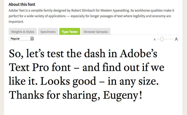
- Adobe Text Pro by Robert Slimbach even included alternates! (“A pleasant surprise.”)
- Agmena by Jovica Veljović uses side bearings with the dash. (“Not a pleasant surprise.”)
Are there proper dashes in the font I want to use, or not? A quick test makes it visible:
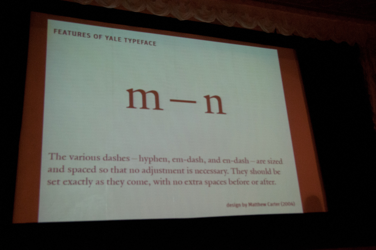
Matthew Carter’s typeface for Yale University includes proper dashes: no adjustment necessary.
Good news (to me as a writer as well): obviously there are type designers who care about the dash. Eugeny mentions Matthew Carter, who is (and always was) very much in favour of designing a dash for each font, and to design it properly of course, “so that it can be used just as it comes”. Maybe you like to search Matthew Carter’s font families specially for the dash; would be worth it, I am sure. And for German readers here you find a review including Matthew Carter’s excellent talk about “Untypical Type” at last year’s conference in Raabs (Austria).
Maybe a possible solution could be to use a dash from a different font? But that “can be an unpleasant surprise as well …”.
A lot of old fonts still exist where you can only solve the dash problem manually. With newer fonts, it is easier, as we saw (if we were lucky) because they often have dashes which are designed especially for the font. Like any quotation mark or comma.
Stroke of thought
I very much liked the fact that Eugeny raised the question about the linguistic function of the dash, comparing, for example, Russian and German. And how about its vertical placement? He suggested that the dash should be placed at the middle bar of the “e”.
During some of the exhibition gatherings, I had the chance to talk to him (with some Russian help by type-designer-book-lover Daria Petrova, who is a native Muscovite and accompanied us from Berlin). Above all, Eugeny Grigoriev is a book designer, which is where his attention and interest in the dash and its history and function arose from. He knew that the German dash is traditionally an en-dash with spaces before and after the dash (you can easily write it using the “alt” key together with the hyphen on your keyboard – AppleMacintosh only).
I shared with Eugeny the beautiful notion (and he liked it a lot) that in German, the dash is called Gedankenstrich which literally means “thought stroke” – a stroke that marks the end of a thought and the beginning of the next, or a new thought that suddenly comes to your mind, so you add it to your text. Thus, the German expression Gedankenstrich for the dash very literally refers to the function of the sign, which it has in other languages as well, remember, rather separating than uniting two thoughts.
Eugeny kindly explained that with Russian language and typesetting the rules (not only) for dashes are very dogmatic, restricting you as a typesetter and designer. That is why he wanted to find out about the different possibilities – to maybe choose from, to have more variety. Which goes in general for him as a book designer.
We very directly got the impression that people like Eugeny Grigoriev not “only” do research work about letters. Typographers and typographic researchers in Russia seem to strive towards cultural changes. Other speakers at Serebro Nabora added to this and backed up our insights about the specific role of type (and) design in certain cultural and political systems.


PS
From Russia with love: this Serebro Nabora conference took place in Moscow on 29/30 November 2014 – embedded in a week of intense workshops around type design and technology. A great experience (and not cold at all), turning several kinds of expectations and letter-drawing rules on their head. Learn about specific Russian perspectives, get to know “functionovelty”, find my comprehensive Serebro Nabora 2014 report with loads of pictures originally published in two parts on Fontshop News (March 22 and April 13, 2015), and get an insight into ten conference days in Moscow that had a lasting impact on us participants.
Serebro Nabora Part 1: The Dutch Invasion
Serebro Nabora Part 2: Exploring, questioning, confirming conventions
If you have the chance, please visit next Serebro Nabora conference of course – highly recommended. спасибо, Москва!

Feeling like a type family: Daria Petrova and Aleksandra Samulenkova of LucasFonts, Just van Rossum, Krista Radoeva, Maria Doreuli, Erik van Blokland, Frederik Berlaen, and Alexander Tarbeev’s sons at their place (picture found at Alexander Tarbeev’s FB account, with kind permission).
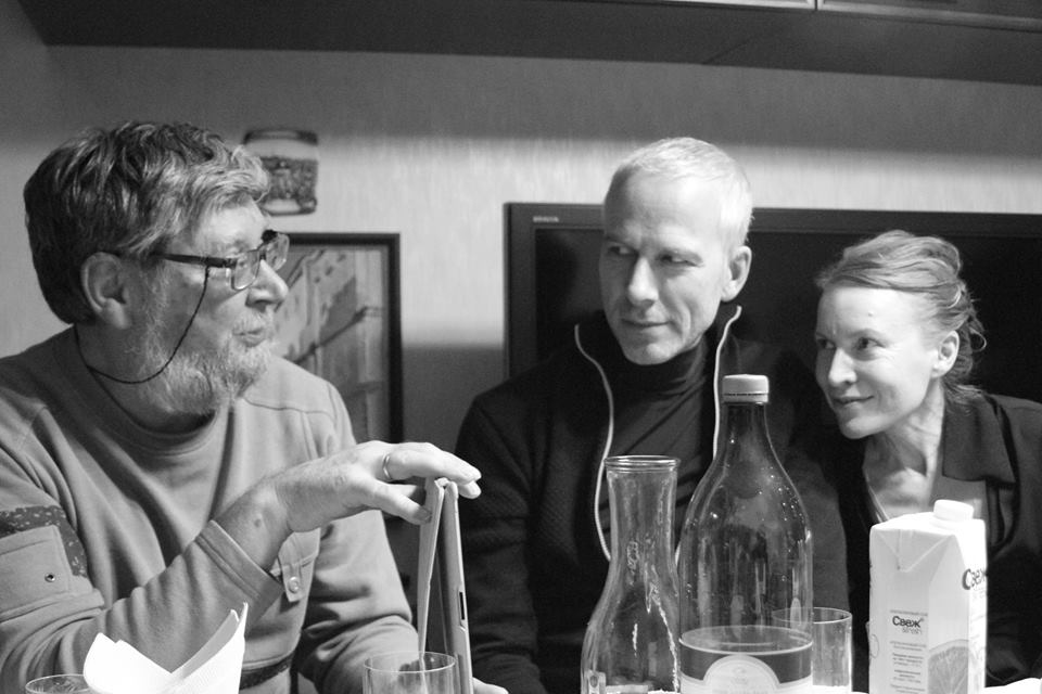
Aleksander Tarbeev, Luc(as) de Groot, Sonja Knecht, Moscow 2014
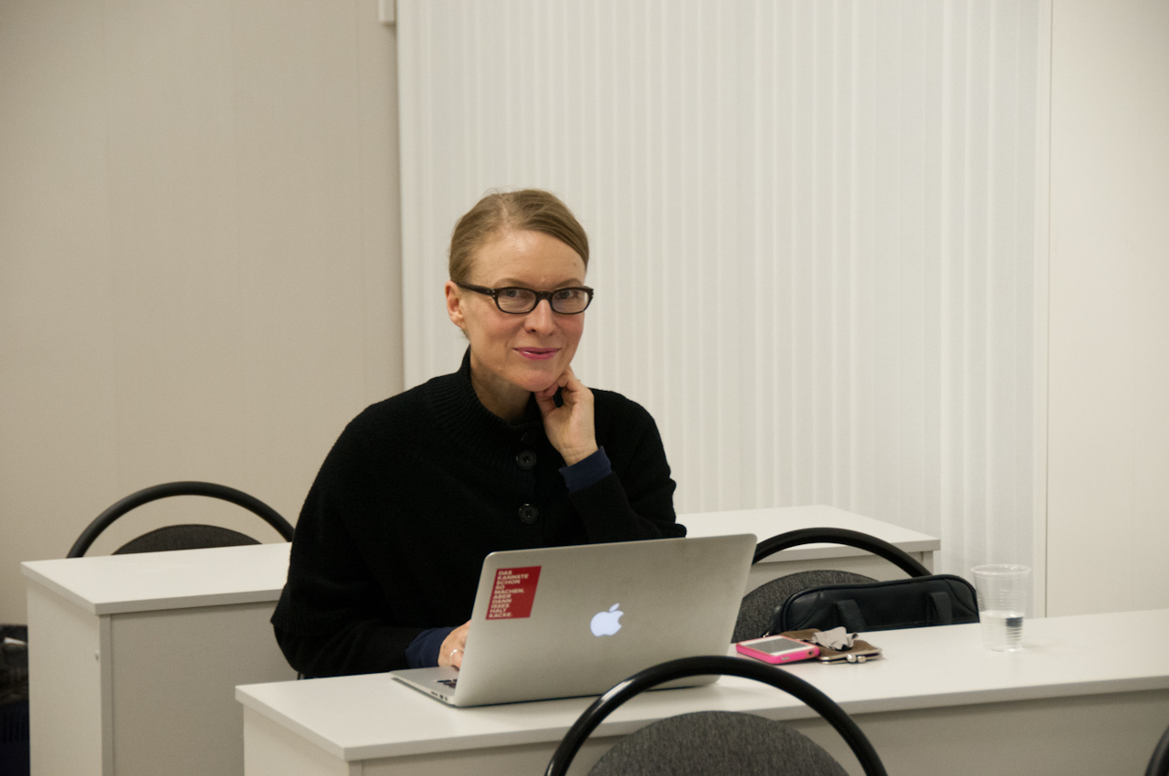
Yours truly as embedded “type writer”, in Luc(as) de Groot’s workshop
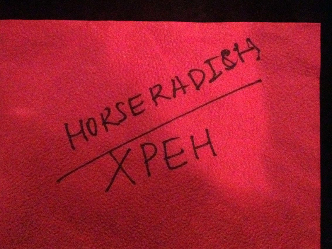
We got to know this too (not only the word); they put it in their vodka.

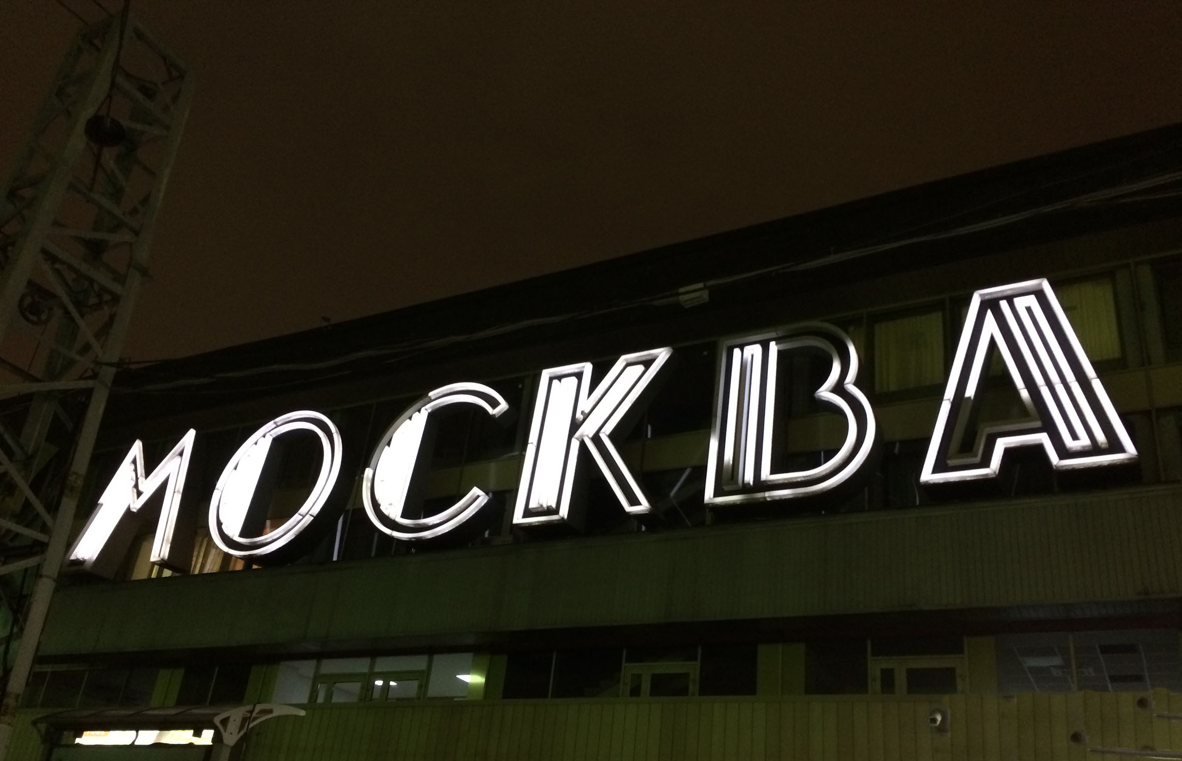
Conference pictures by myself, street pictures by Luc(as) de Groot.
Please see also Maria Doreuli’s impressions of Serebro Nabora 2014.
