Share some expeditions into the wider, and beware, the wilder fields of typography. To be located not only in Spain …
With Typographic Dialogues, the theme of their 58th conference (held from September 17 to 21, 2014), Association Typographique Internationale invited aficionados from all over the world to Spain – to indulge in a delightful mixture of workshops, lectures, social events and exhibitions in the wider fields of typography. Actually it went much wider and wilder than we expected, covering local, global, social issues of some relevance.
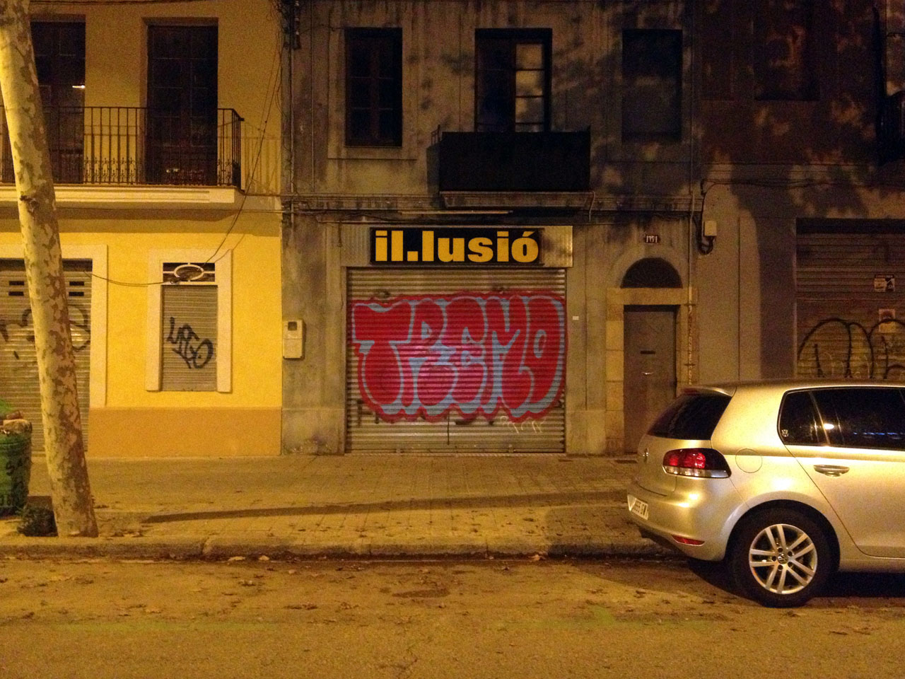
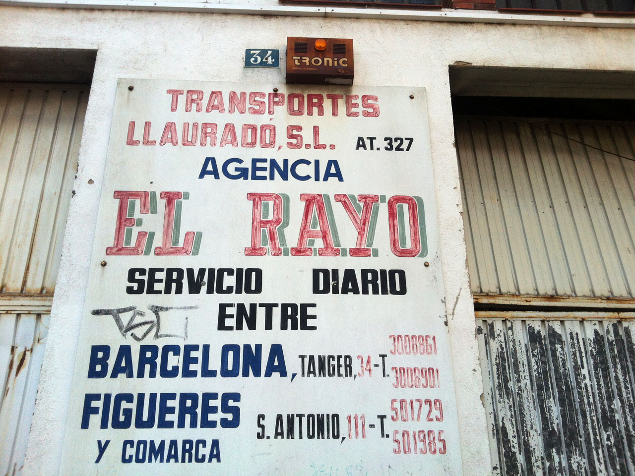
The sky in Barcelona is baby blue. It is called “cel”, which is Catalán. Or “cielo” in Spanish. Yes, the main official language in Barcelona is Catalán, followed by Spanish, then English – first thing you notice as a visitor. Looks like pure harmony-gone-type. But wait, appearances are deceptive, sometimes.
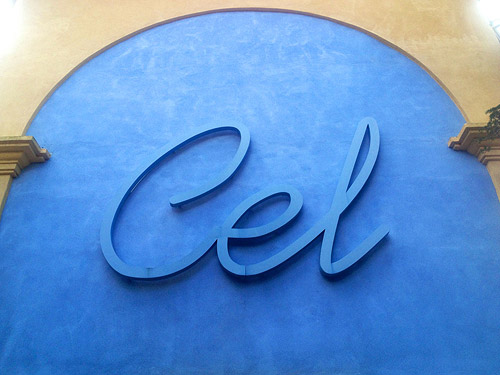
The sky in Barcelona is blue almost all the time and is called “cel” – which is Catalán. Or “cielo” in Spanish.
We spent two days (with practical and educational topics) in the BAU Design College; then for the three main conference days (with longer lectures focusing on history and international strategies) we moved to the Museu del Disseny (this is Catalán again). Terrific venues! Please take a look at ATypI’s presentations programme to get an idea of what we encountered. It was a lot. Here I can just try and share the intensity, accentuating personal favourites, pars-pro-toto style – and what struck me most.
Remixing rules, research live on stage, and tricky type teaching
There were excellent technical talks, like Parametric typefaces in a nutshell by Berlin-based Thomas Maier. It was much more than a nutshell actually: he span history, theory, early tools and tools today around “formula-driven typefaces”, giving loads of hints for trying out. ATypI attendees could directly dive into the matching workshops.
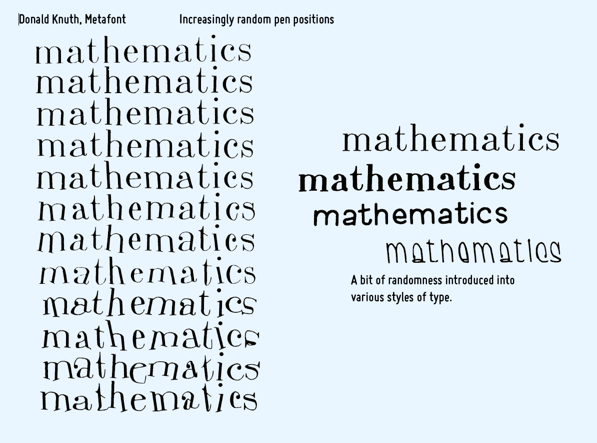
For Metafont, Donald E. Knuth (in 1979) created different styles by varying the parameters and by increasingly random pen positions.
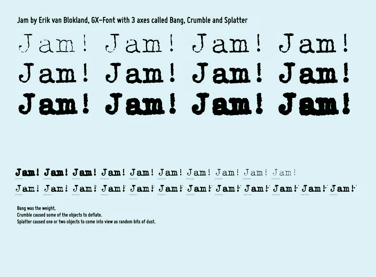
Jam by Erik van Blokland with three axes: “Bang” is the weight, “Crumble” causes some of the objects to deflate, “Splatter” causes one or two objects to come into view as random bits of dust.
And there was Kevin Larson. He is a researcher on Microsoft’s Reading Technologies team and he actively engaged with the audience. Using a fun presentation technique of asking questions instead of stating theories, he gave a live demo of what research is like, and how rules are in transition. Where in the following sentence would you put a comma? “The only people I have ever met who believed their ears were blind”.
No wonder this was followed by a heated discussion amongst the audience. Ann Bessemans added to this, making us consider the aspect of rhythm: how do we grasp content? In which ways can this be influenced by your choice of typefaces? You might know Ann Bessemans as a contributor to TYPO Berlin 2013 and by her research-based font Matilda.
Dan Reynolds tried out 10 methods to teach type and still would be open for a method 11 or 12, “if they work”. Sofie Beier applied legibility studies, and Martina Flor uses a trick: “Teaching lettering is a friendlier way of saying ‘I teach type design’”.
Privileges, politics, and pain
And what if you have motivated students, but no teaching structures at all? In his lecture Looking for roots, Domen Fras illustrated how difficult this is, in his case in Slovenia. He encounters a lack of historical sources and a lack of fonts that support the functional aspects of the Slovene (and other) language systems. Domen only found four existing books on typography in his mother tongue, and Tipo Brda workshops at Ljubljana University as the first of their kind in his country: a silver lining on the horizon.
Luckily, there are more fighters in the field of language systems with special marks and (neglected) glyphs, like Filip Blažek, Petra Černe Oven and Veronika Burian, who in 2014 spoke about intercultural aspects of type design and typeface usage at Raabs conference in Austria (read more in German in my Bericht aus Raabs; and Radek Sidun from Prague who even wrote a Diacritics Manifesto.
Domen’s presentation made us aware of how privileged we are, living in Berlin, for instance, with its high density of type designers, several universities with art, design and communications curriculums, lettering workshops, meetings points, and a huge conference. How about other countries?
- Impressions from Great Britain: The 6×6: Collaborative Letterpress Dialogues project is supported by six design schools. Still, Rose Gridneff, Alexander Cooper and Andrew Haslam pointed out political implications of their work.
- The (almost non-existing) history of French typography: Thomas Huot-Marchand described several revivals of the ANRT (Atelier National de Recherche Typographique). As its current director he does his best to make an impact on type research and interdisciplinary partnerships. The ANRT offers generous funding for complex, long-term projects, like the digitisation of the typeface for the Französisches Etymologisches Wörterbuch by Walther von Wartburg (with at least three diacritical marks never before combined in one font). It is the PHD project of Sarah Kremer; another one would be Sébastien Biniek’s (Sebastian Biniek’s?) research of type and textual hierarchies used in large-scale maps.
- In Spain the current situation seems to be devastating: Raquel Pelta, professor at the department of fine arts of Barcelona University, in her key note (and in vibrant Spanish) spoke about graphic design for social change. Her focus: how type and typography help to spread the rights (“ayuda difundir los derechos”) of citizens and are a prerequisite for the freedom of press (“la libertad de la prensa”).
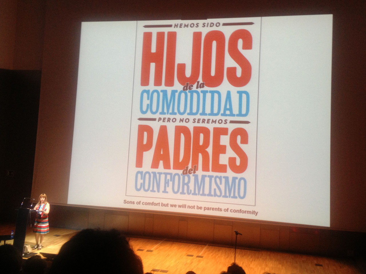
Raquel Pelta displaying strong statements live on stage and on posters (“We were children of comfort but we will not be parents of conformity”).
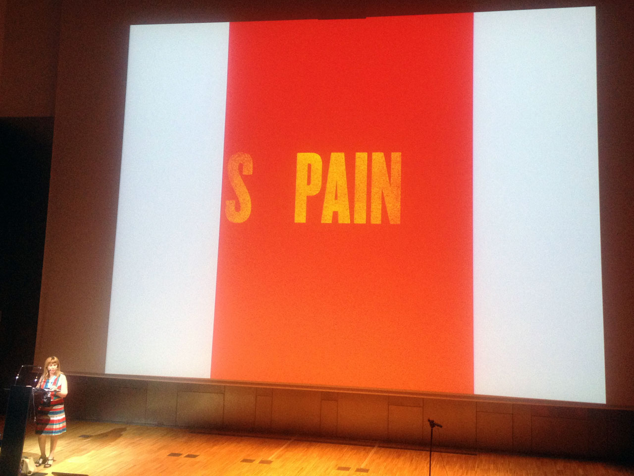
Painfully descriptive.
Raquel Pelta backed up her statements with a well-selected range of posters, art installations, and subversive fonts. Probably the most impressive of those posters was the most simple, just displaying the letters “S PAIN”. These letters seem to literally embody the hardship our Spanish colleagues (and their whole country) have to bear. Pelta, in her forceful way of speaking, was not shy to admit that “esta situación nos hace un enorme dolor” – in no need of translation.
Some speakers added to this by translating their personal and professional pain about seemingly local issues to a level of global concern.
The Catalán state of mind
In this sense, I want to highlight a very specific typo-cultural topic – and one of my absolute favourite talks from the conference. Getting acquainted with The Geminated El (ĿL), as presented in depth by Dr. Oriol Moret-Viñals of the Faculty of Fine Arts, Barcelona University, was a true pleasure.
Originally the geminated el was a single character formed by two els and a middle dot between them. The Ls were as close to each other as possible, like in the Spanish double L (for example in “calle”). The geminated L (“ŀl” or “ĿL”) is exclusive to the Catalán language, similar to the Eszett (“ß”) in German.
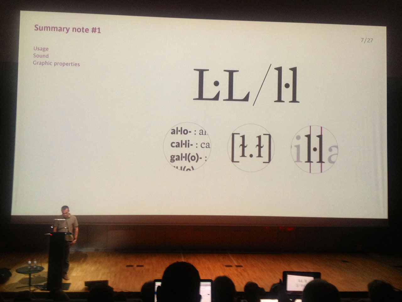
The Catalán geminated el should be treated as a single character, formed by two els with a middle dot, says Oriol Moret-Viñals.
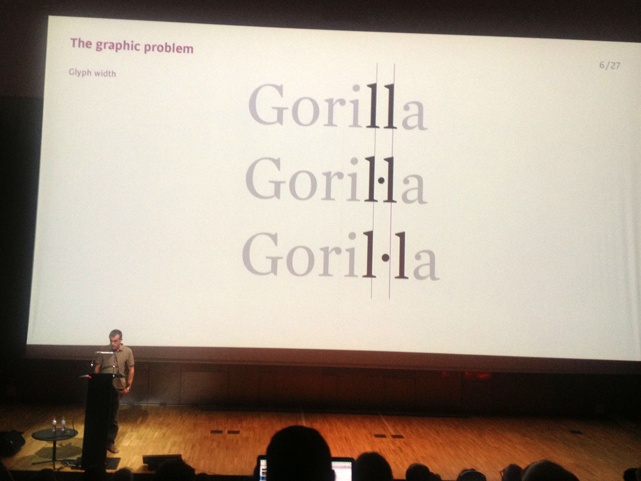
There was no problem in metal type (as there was one sort for the geminated el). The confusion began when the character “l·l” was broken into “l·” or “·l” in due to the monospaced aspect of the typewriter, and subsequently on the computer. In 2004 a group of typography professionals set out to restore the original geminated L as a singular character in the digital world. Oriol Moret-Viñals – a singular character himself – gave us an excellent, well-structured overview of the history of the geminated el and its cultural implications. He focused on encoding and typographic construction as a starting point – or better: “continuation point” – for reinstating the character. It was impressive to witness how serious this issue is, not only to Oriol and a group of researchers and type geeks, but also to a large group of native speakers.
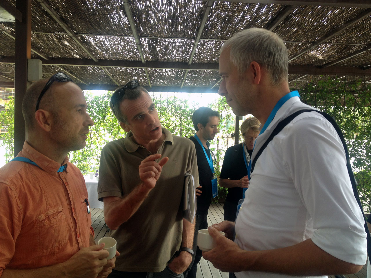
Dr. Oriol Moret-Viñals and Marc Antoni Malagarriga-i-Picas (Catalán names!), both of the Barcelona University, explain the importance of the geminated el to Luc(as) de Groot.
Catalán is spoken by 8 million people. It is the second most commonly used native language (after Spanish obviously) in Catalunya, a region in north-eastern Spain. However there seems to be no official acknowledgement of this fact, even though you encounter bi- or three-lingual signs – in Spanish, Catalán, and often English – in Barcelona, even as soon as you arrive at the airport.
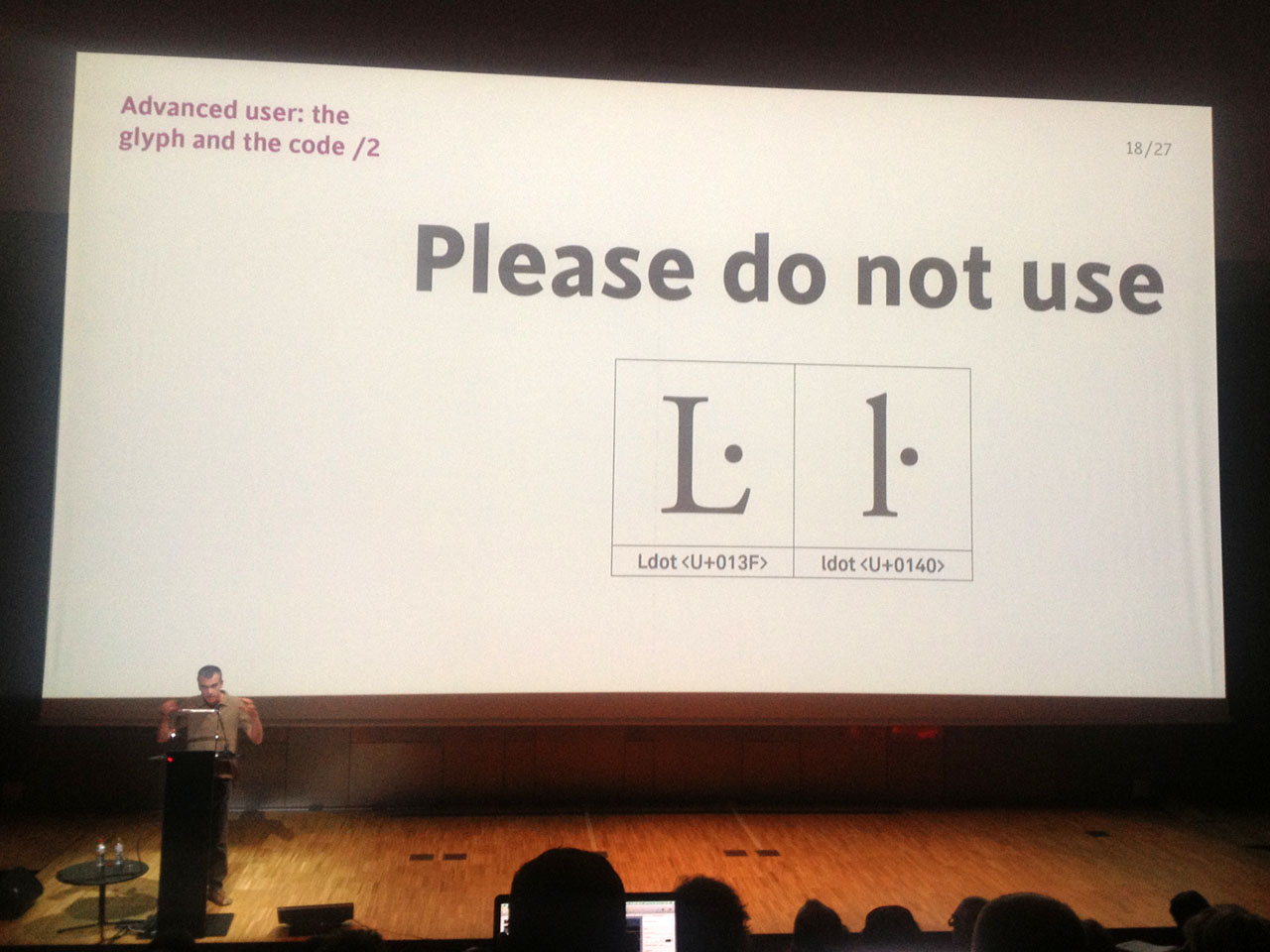
“No Latin typeface could be complete without a geminated el”.
Just in case the message (el mensaje, el missatge) did not come across, Oriol’s concluding statement was a serious and sincere request: “no Latin typeface could be complete without a geminated el”.
This lecture had something archetypal about it.
Luckily we were able to continue discussions during coffee breaks, in the evenings and even on Barcelona beach, with sympathisers from all over the world. You can hardly get any more intercultural than this. The interesting thing was how mindsets of people from different countries can be so equal – and what tends to happen, worldwide, when a language system is neglected or subdued. Driving this question further, you soon realise that it is not “only” about a single glyph, some diacritics or a language system being suppressed.
Balkan beats
The topic of (missing) official acknowledgement allows me to segue from southwestern to southeastern Europe into the impressive presentation by Nikola Djurek from Croatia.
Before introducing us to his “typographic system that weds Latin and Cyrillic scripts” based on a phenomenon known as “the Balkan sprachbund”, the Typonine founder pictured the tremendous upheavals in the area – caused by the Russian attempts to impose Cyrillic letters. Sprachbund is a German term used to describe neighbouring languages that “merge in sound and grammatical features”.
Alas, in the Balkans nothing seems to really merge, at least not peacefully. Not even in type.
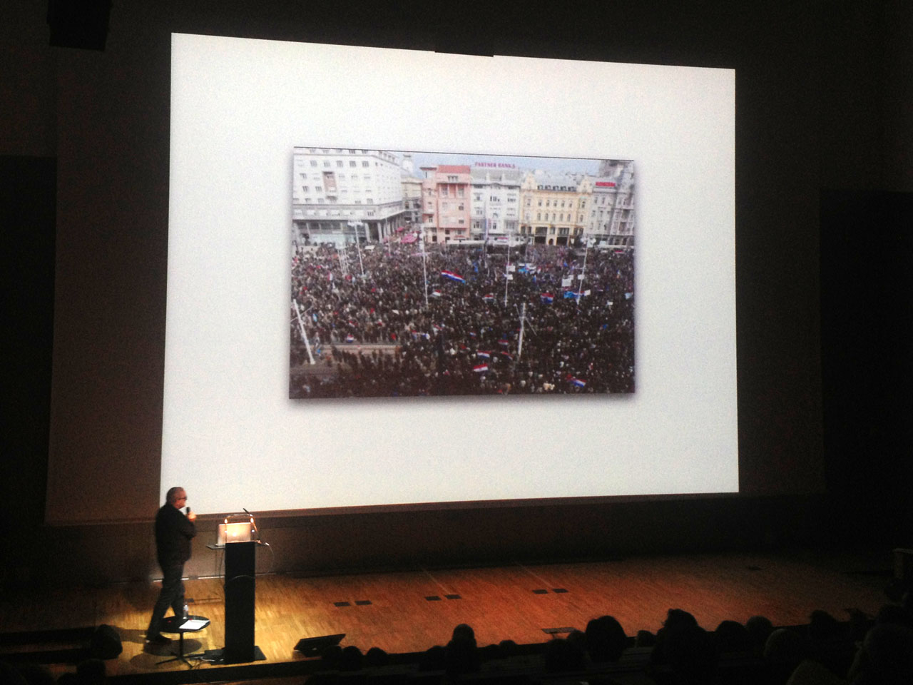
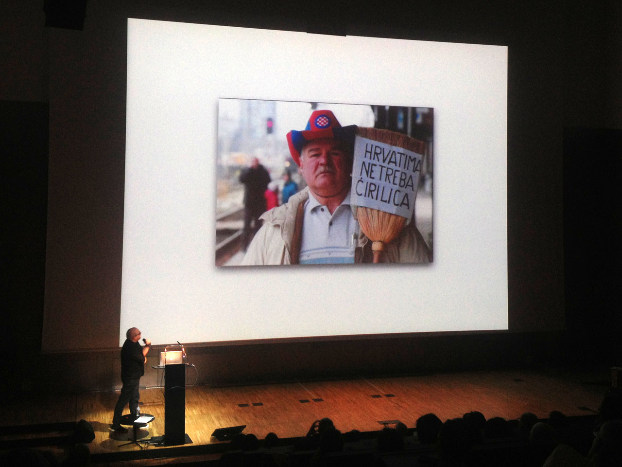
Obviously a predominant Balkan mood: “Croatians don’t need Cyrillic”.
Nikola Djurek sketched what happened. Throughout history six scripts were used in the region, among them Latin and two kinds of Cyrillic. The accompanying bitter and bloody conflicts last until today. Nikola showed us pictures of heavy demonstrations against Cyrillic. When the authorities tried to make Cyrillic the official script, the population screamed bloody murder and removed the announcement sign repeatedly. People violently protested. “Croatians don’t need Cyrillic” is how Nikola Djurek dryly sums up the predominant mood. He knows the deep-rooted sense for the need to defend against repression, even among officials: one of the policemen who had been ordered to protect the Cyrillic sign turned out to be the hero who helped to remove it. He was worshipped by the population, but soon unemployed.
A core question: is it possible to peacefully harmonise different regional script systems if the regions themselves do not?
Without ignoring history and in a respectful and serious manner, Nikola Djurek proceeded to identify the features shared by South Slavic language systems like Bosnian, Montenegrin, Croatian and Serbian. This is what makes his typeface Balkan, or we should rather call it a type system, so interesting: Balkan Sans is a sans/stencil type system for Latin and Cyrillic published by Typonine foundry and awarded by the Type Directors Club in 2012.
Typo Tapas with Brazilian posters and Barcelonian butchers
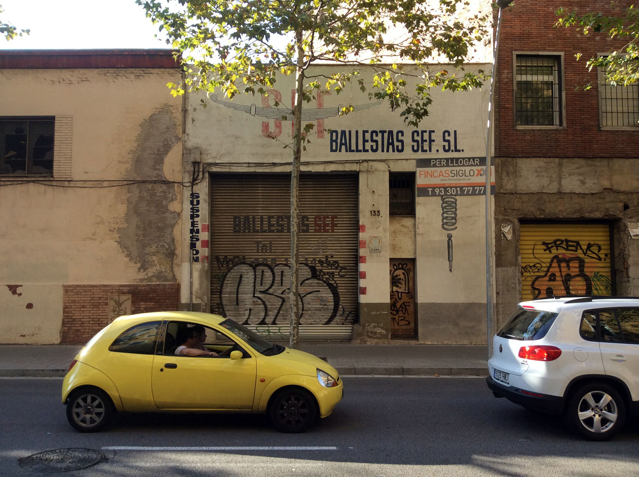
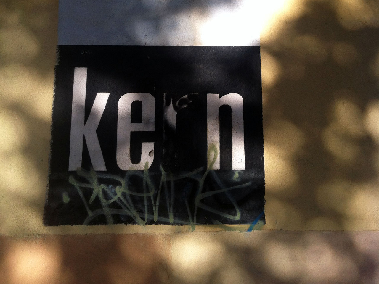
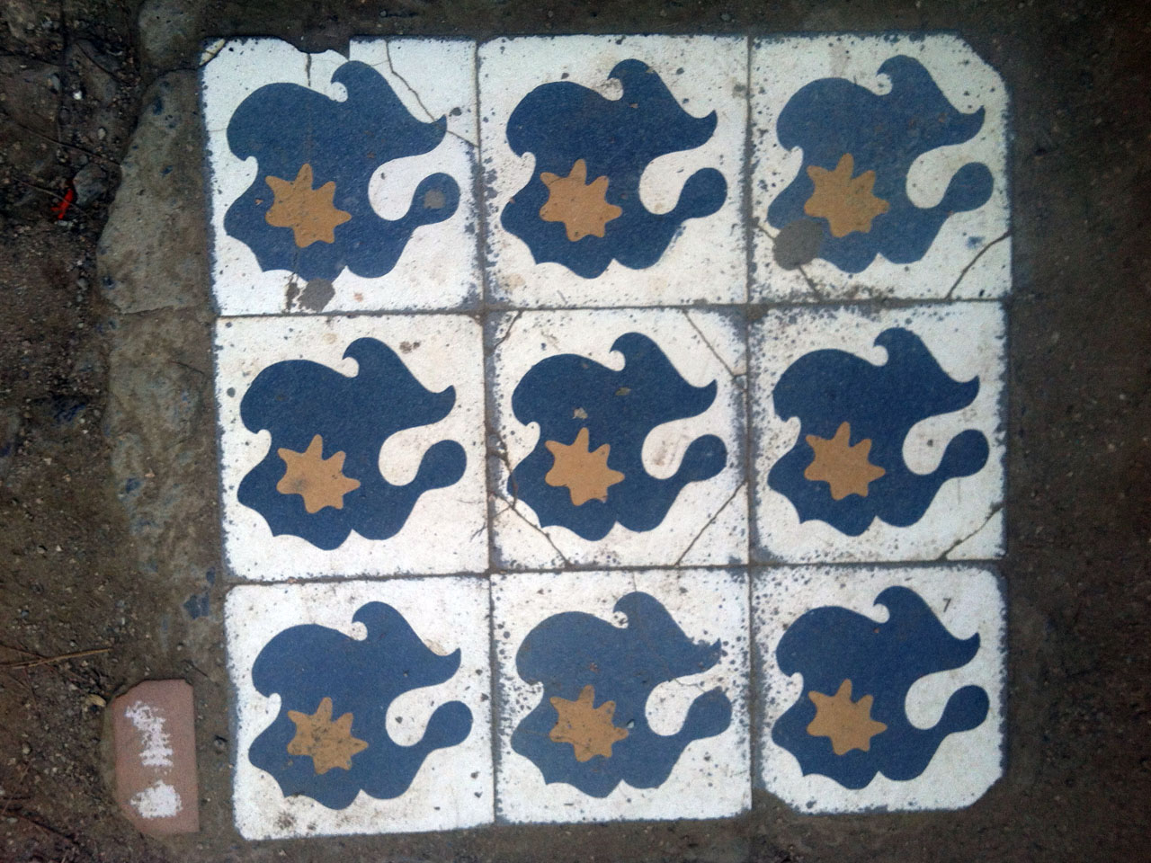
A much more light-hearted approach to cultural differences were the Typo Tapas in Barcelona, a series of short, visual presentations garnishing the conference days. Thomas Maier (yes, he who before shared his technical knowledge with us) presented the street fonts collected by his friend Martin Ulrich Kehrer: countless photos of shop front lettering taken in Barcelona and Vienna. Alternating between the two cities Thomas made us experience two Urban Alphabets, demonstrating how letters are cultural catalysts.
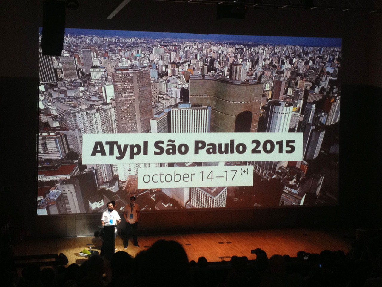
Paulo Moretto’s visually rich talk was actually not that much of a “talk”. Paulo (@postaposter on Twitter) had selected 200 posters from a total of about 8.000, all designed in his home country Brazil – some of the best by himself actually. He quietly stood in the shadow at the side of the huge stage, barely saying anything while flicking through his slides. This was a nice change of pace as it gave the audience a moment to wind down and allowed them to indulge in the mostly wordless spectacle. The visual dialogue between typography and image proved to be “sometimes a monologue”, as Paolo commented, and was often very sophisticated. The audience appreciated the hand-made references, the figurative minimalism, and all those other beautiful impressions – that eventually turned out to be a teaser for what we can expect in 2015. ATypI is going to São Paulo! Being the first ATypI conference in the Southern hemisphere, it sure deserves to be as sold out as ATypI Barcelona.
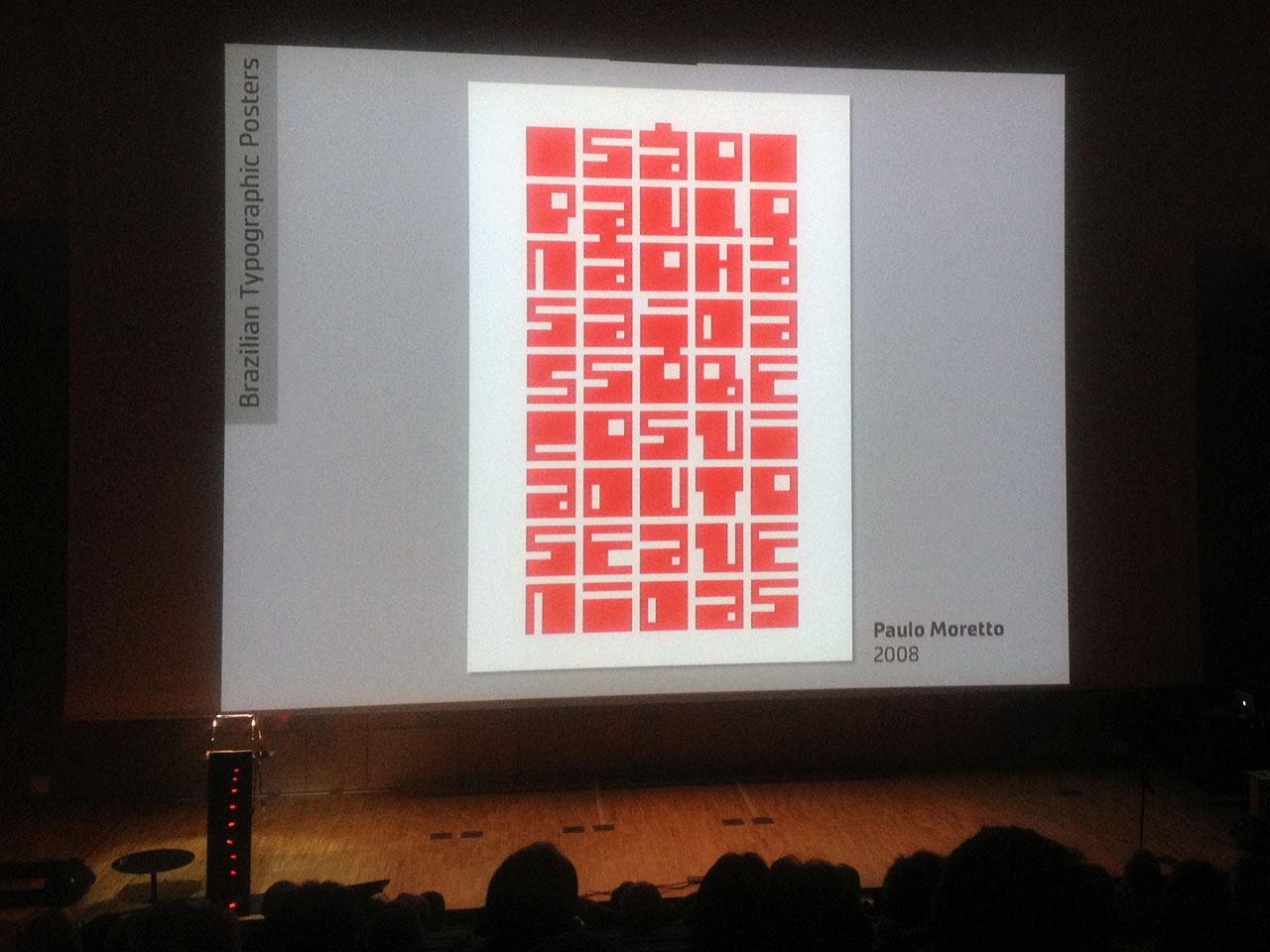
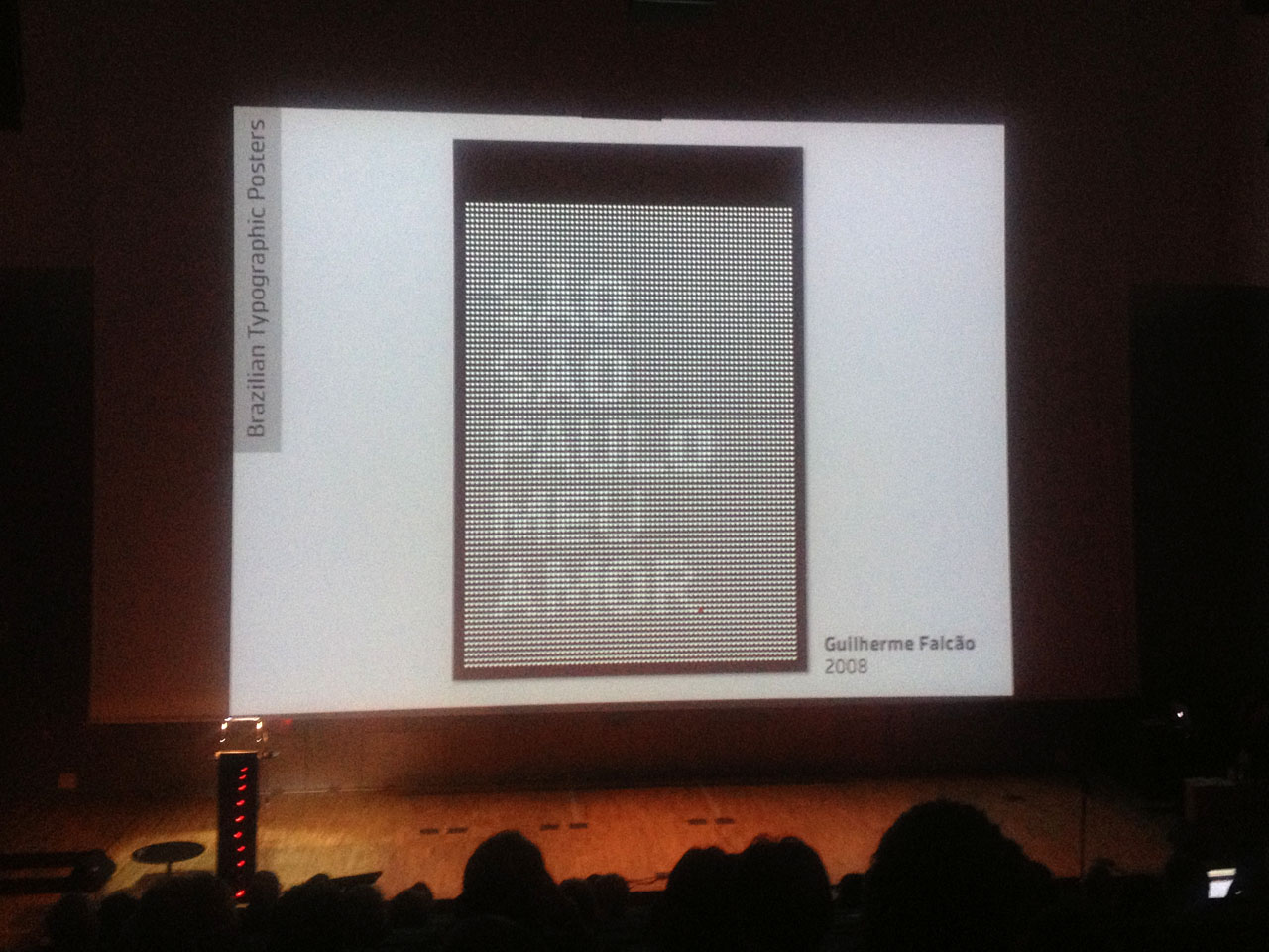
With his presentation, Paulo Moretto added some Portuguese to Spanish and Catalán: mi amor /// meo amor /// meu amor.
Almost as colourful as the Brazilian posters (at least if you think of blood red), yet the biggest possible contrast with their sophisticated designs proved to be the DIY wrapping papers by Barcelonian butchers. Andreu Balieus granted us a peak into his delicious collection. He either seems to be a manic hoarder of these vernacular forms of art, or he must be highly addicted to Spanish jamón. Or both. Many of the examples pictured stylised assaults to the lives of cows, pigs and chickens, thus threatening to disturb the more sensitive souls in the audience. No worries though. Andreu is not a butcher, but a vegetarian himself (since more than 20 years).
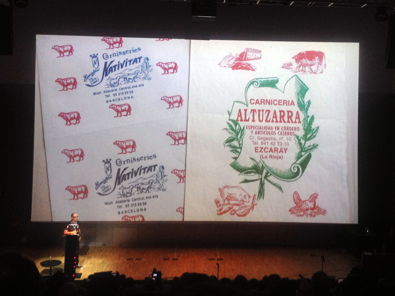
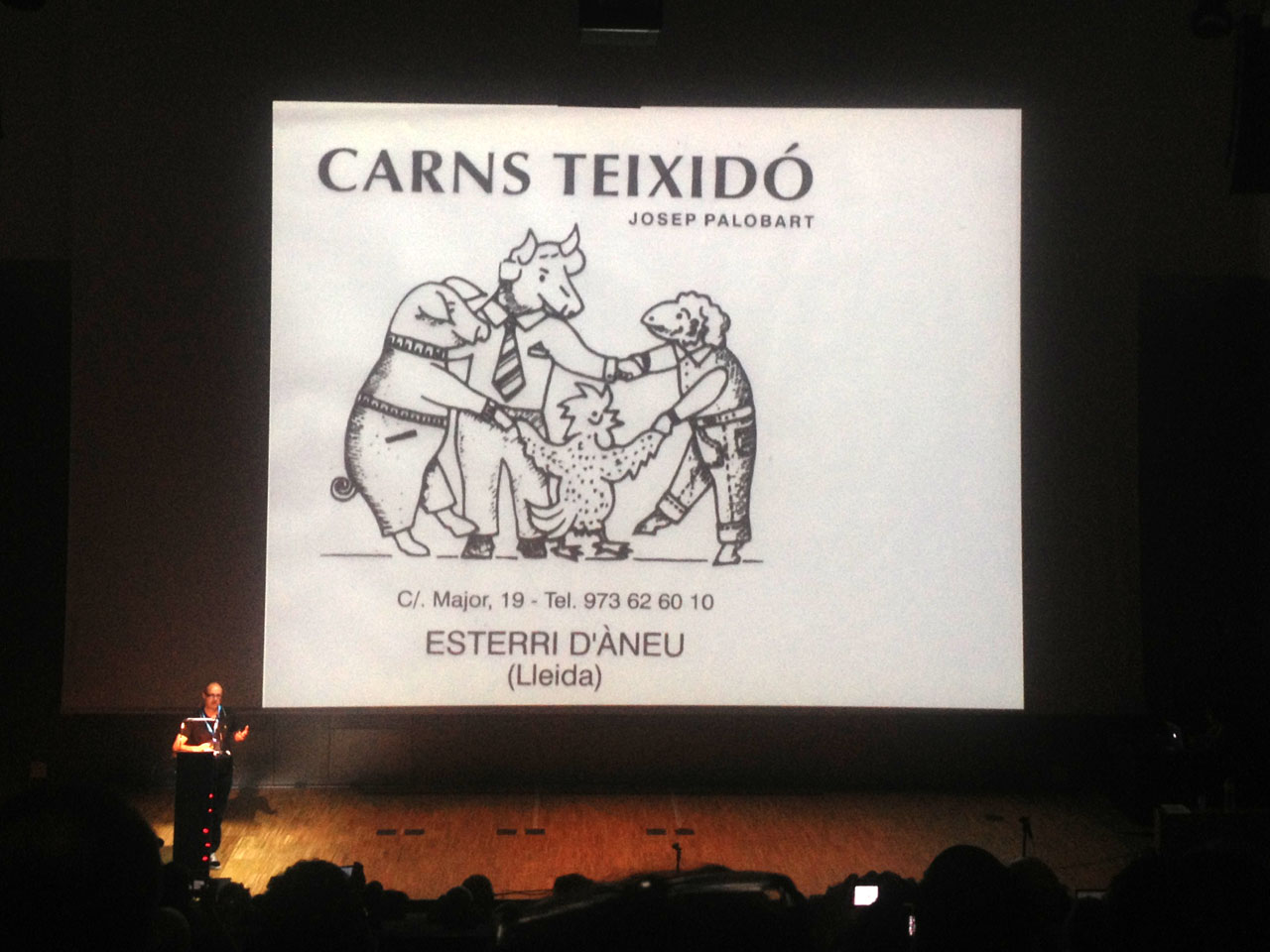
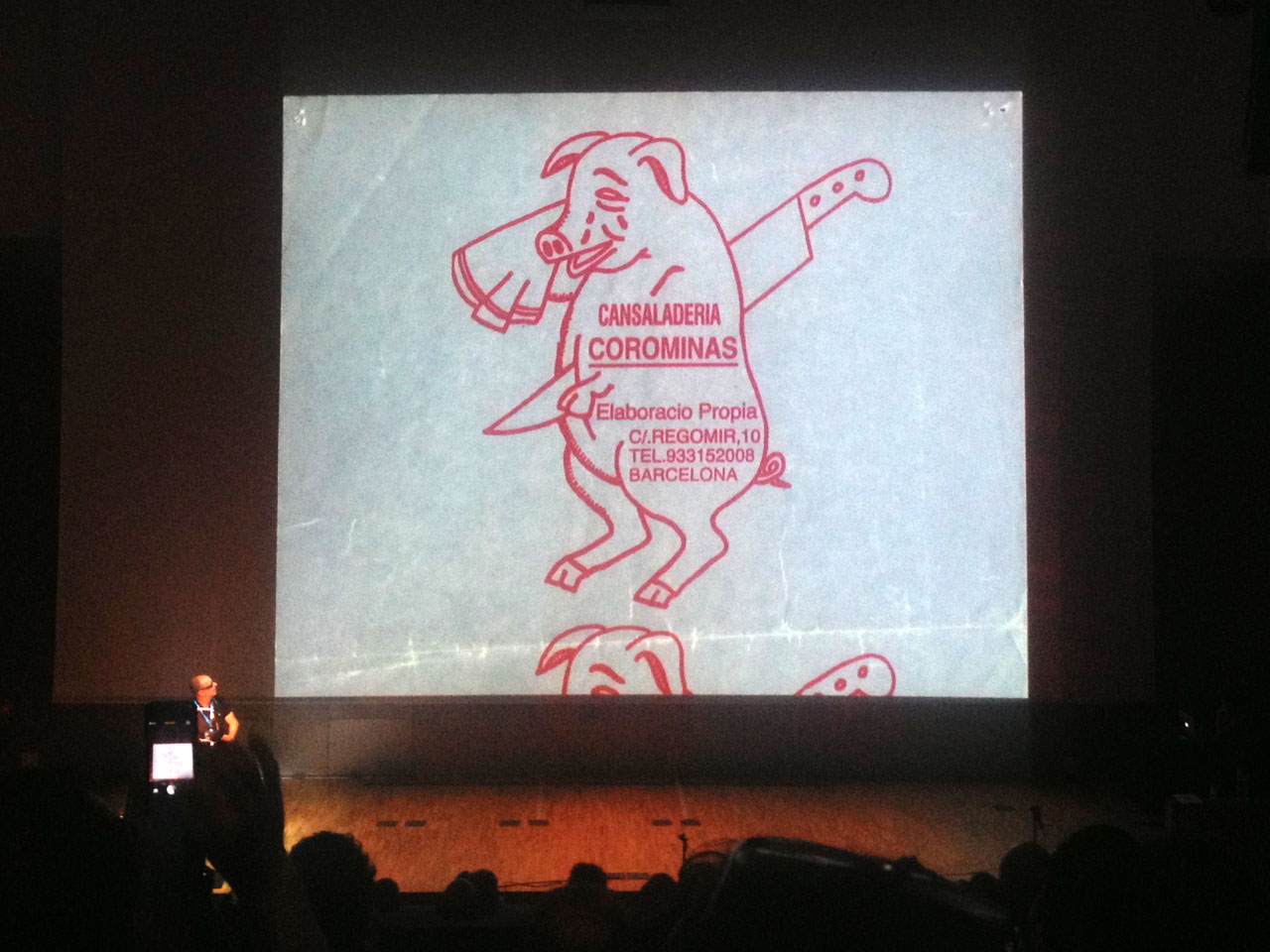
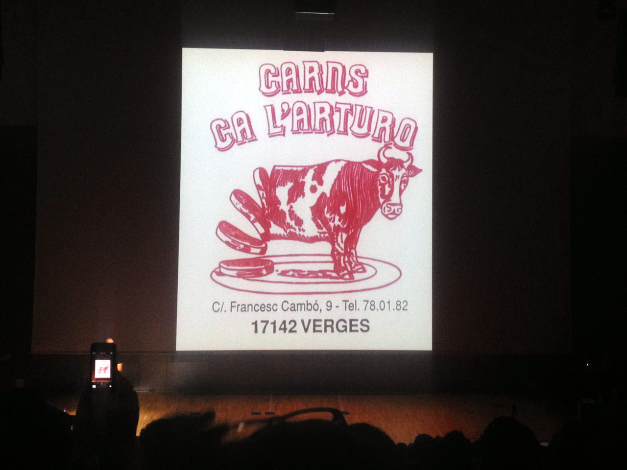
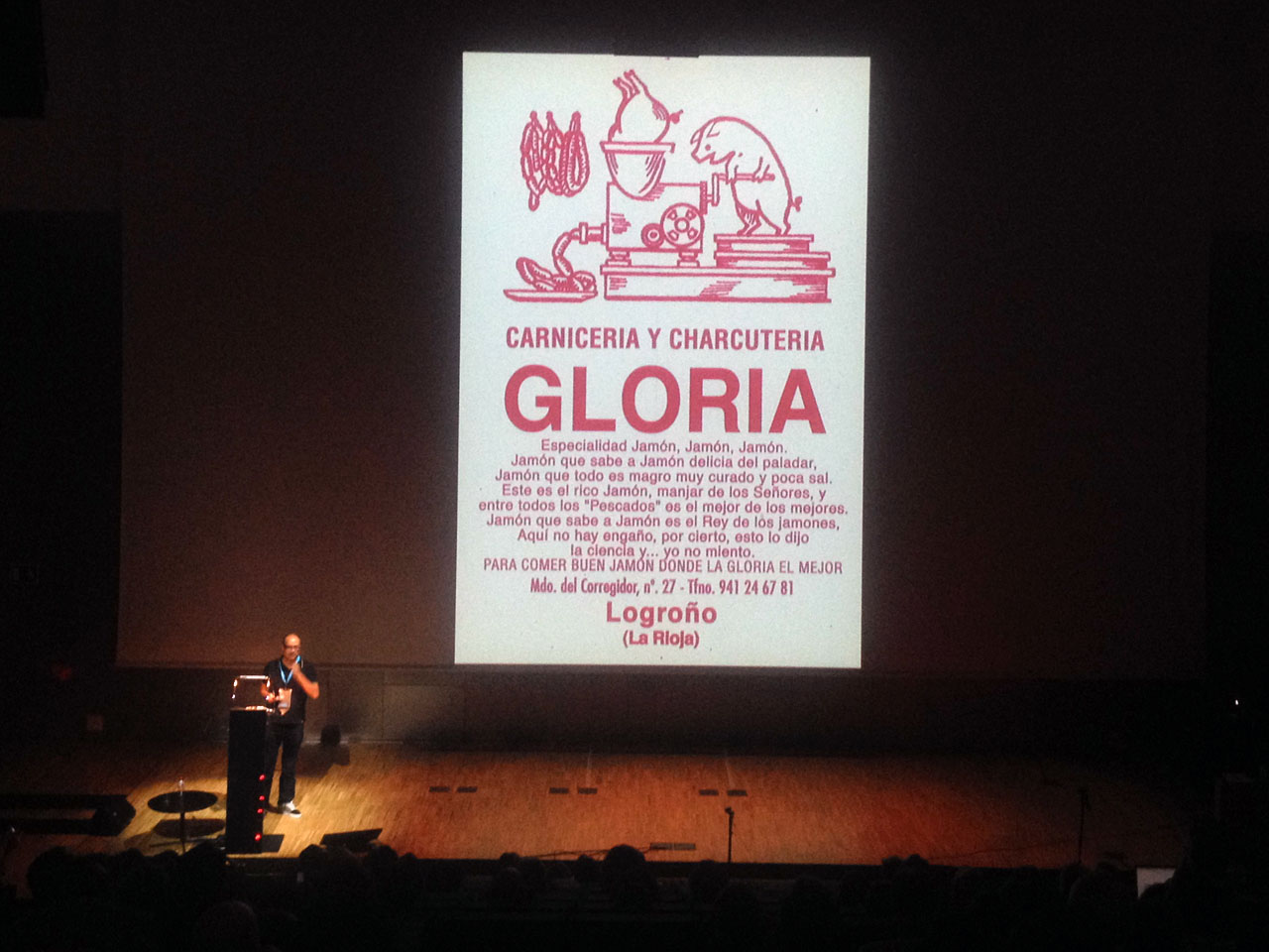
¡Jamón, jamón! The predominant colour here is obvious, the explicit nature of some illustrations quite shocking.
These Typo Tapas really were dripping with blood and gave us a better insight in the local graphic culture. Although, “local”? I guess if you walk around your own local areas with eyes open you might come across similar examples. What about starting a collection of, say, bags of pharmacies, or service stations, or – to accommodate the vegetarians – groceries?
Local idiosyncrasies, global lookout
Yes, quite a few talks in Barcelona illustrated how you can determine the cultural identity of places (and people of course) by their type – choosing drastic, humorous, haunting ways of displaying their topics.
Liron Lavi Turkenich from Israel told the audience “radical anecdotes in search for solutions” which she faced when dealing with Latinised Hebrew. Boris Kochan presented awarded projects from the wonderful Granshan Competition for non-Latin typefaces. Rezan Gassas showed Arabic adaptations of global brands. Indra Kupferschmid investigated Wagner & Schmidt, a Leipzig punch cutting and engraving company from around 1900, and explored how they “complicated type history” (if you want to find out more on the history of German grotesk typefaces, read her notes on Akzidenz-Grotesk or I had never loved Helvetica). Gerard Unger examined Echoes from the Middle Ages, exploring the “somewhat overrated” influence of Trajan capitals. From there Yves Peters took over, showing how Trajan became the most used typeface in movie posters. He ended with “a shimmer of hope” that this might change, with Gotham possibly taking over the film world, a trend started with the Obama campaign.
The lectures were packed with information and fascinating details. I remember Jesús Barrientos from Mexico discussing the fact that “nomenclatures can be very different from country to country”. He explained the meaning of the expression “gótico” in Spanish, which differs from what English or German designers mean when they use the words “Gothic” or “gotisch” in typography. Dr. Özlem Özkal and Onur Yazıcıgil demonstrated how Turkish print culture integrated German influences in early 20th century, believing “that a stronger dialogue between today’s practice and the early efforts that transformed a set of symbols into a functioning media, will inspire, connect and encourage professionals and educators”.
What a beautiful outlook, for ATypI conference 2015 and for typography worldwide – even more if the geminated el and Slovenian diacritics and other “minority” characters are being integrated.
PS
Please find my comprehensive ATypI 2014 report with loads of pictures originally published as follows: parts 1 and 2 on FontFeed (October 30/31, 2014); parts 3 and 4 on Fontshop News (December 23/30, 2014):
Global, Local, Social: ATypI Barcelona 2014 (Part 1) sumarises the technical advice provided in lots of user-centered lectures.
Global, Local, Social: ATypI Barcelona 2014 (Part 2) addresses educational issues, live research, and looking for roots.
Global, Local, Social: ATypI Barcelona 2014 (Part 3) focuses on some striking intercultural aspects of the conference.
Global, Local, Social: ATypI Barcelona 2014 (Part 4) provides understanding for some corporate and historical issues.
And if you have the chance, visit one of the next ATypI conferences of course. It is worth the ride, wherever it takes place. Moltes gràcies, muchas gracias, thanks a lot, Barcelona!
Speaker Sofie Beier meeting Danish colleagues at ATypI Barcelona.
Lucas de Groot (LucasFonts) and Yuri Yarmola (Fontlab) agree in colour.
Albert-Jan Pool (who gave a talk on “the one-eyed a”) and Andreas Frohloff (FontShop/Monotype) chatting at ATypI Barcelona 2014 (after work).
The tallest ladies in type design, Daria Petrova and Aleksandra Samulenkova of LucasFonts – aka “Dascha and Sascha” – bodyguarding their boss (after some Caipirinha).
Aleksandra and me in the Mediterranean sea (after midnight).
All conference pictures taken by me, street pictures by Luc(as) de Groot; the two presentation charts with parametric typefaces are from Thomas Maier’s presentation (with kind permission), sea photo daringly taken by Daria Petrova – thank you all!
